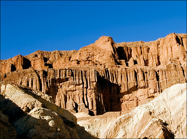
Shadows are a bit harsh, not much you can do about that though. Still, the large dark area at bottom right is a bit distracting. Perhaps a different crop?
4 - Like to have seen the orange stronger for the Challenge, so perhaps tweaking in pp and a tighter crop may have made this better, in my opinion. Also looks a little 'tilted', but could just be the perspective.
Since it's a color study and not a landscape, what if you rotated it so the horizon was on more of a diagonal? i wonder how many people would hate that. . .
while the place looks inspiring, the photo is not...sorry...your location had the potential to get a great shot, and with a little tweaking, you could have had a winner...but this looks like a holiday snap to me with no real depth or thought...sorry to be tough, but you want the truth right?





 Add photograph to your favorites
 Add photographer to your favorites


 Photographer found comment helpful.


