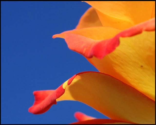
One of the better flow shots for sure. I like the fact this is up close yet makes good use of the negative (blue) space. DOF could potentially be a little stronger for my liking but is also good as is.
Great composition, I would have liked to see a larger DOF, but what you chose to focus on was good. but I love the curves, and the nice punchy colours.
3 - Bordering on a bit of red but fairly minor. Like the abstract and the perspective and detail in the peTal. A more finely tuned crop, centering the focal point better somewhere within your composition make this better in my opinion. Frame detracts, again - in my opinion.
Unfortunately, your image has the same predominant fault as my submission, the DOF is a bit too shallow. Wish I'd have recognized it earlier. Still a nice effort that I bet you learned something from.






 Add photograph to your favorites
 Add photographer to your favorites


