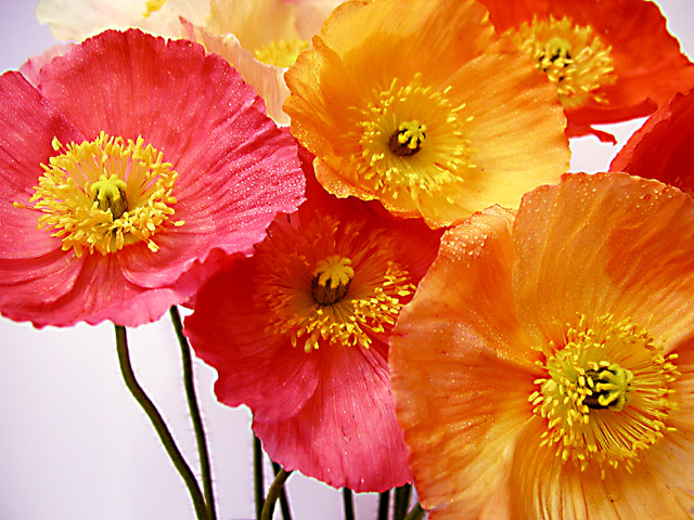
I'm not sure if I think the shallower depth of field worked with this one or not. Partially, I think that may be because I'm not sure, visually, which is actually the dominant flower int he grouping and since some of the portions I'm drawn to are out of focus.... Love the color combination and the touch of white space in LL corner. I think the OOF stems also bug me a little bit. All in all though, one of my fav images this go round.
Beautiful colors. I also like the thaw on the blossoms. Still I don't understand why you left the lower left corner empty. I think it would have looked better when there would be flowers , too.
I think a background that is an orange-yellow color would have worked better. It easy to think that it should contrast with the flowers but in this case, with flowers, I think it is just the opposite. nice cropping.
Very nice job on composition, color, and arrangement. The DOF works well and the foreground is in focus. I suggest that it could use a touch more sharpening (personal preference), which should only be done after resizing (or so the experts say and my experience confirms). Overall a VERY nice job on this photo :-)
Nice, nice composition. You could of left off the stems and placed yet a few more flowers to fill that space. Still I like this, good colors. Nice job. Kee
Copy the comments from the last postcard photo and past here >> Copy the comments from the last flower photo and past here >> Copy the comments from the last one of my top picks this week photo and past here >>





 Add photograph to your favorites
 Add photographer to your favorites


