Author Thread Comments Made During the Challenge
Post actions
Very cool, but not very complementary-dun wrry, i still luurve it, lol :)
Post actions
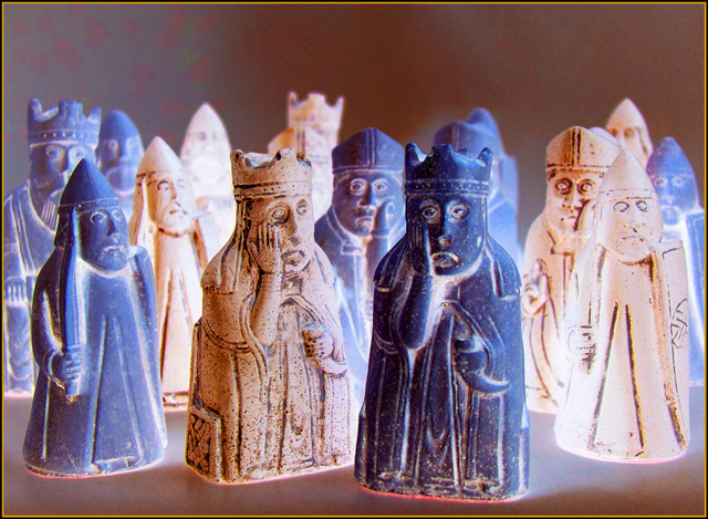
These kings do indeed look worried. Nice title and good photo.
Post actions
haha. loved the looks on the faces... 9
Post actions
Haha! The tones aren't a strong enough contrast.. but si funny!
Post actions
I agreee with your title.
Post actions
LMAO!! 10 for humor-- this made me laugh..
Post actions
Post actions
Hahaha, you get a 5 just for having a sense of humor. If it makes you feel any better, I DO see the yellow and purple.
Post actions
Post actions
LOL excellent composition and color.
Post actions
I like the objects but there isn't much orange for this challenge (to go with the blue)
Post actions
lolol, too funny! I'm laughing at the expression on the faces of the chess pieces. Would have made a great negative image but I think it makes a good complementary colours image too.
Post actions
Nice lighting and interesting hues.
Post actions
uh oh! where are the compliments?
Post actions
This looks a little too overprocessed...
Post actions
I agree with the comment ;-)
Post actions
Comic, I like the composition and the expresion of the two figures. I think the colors need a bit of power.
Post actions
LOL @ the title. Actually, you have pulled this off nicely. I understand the negativity, but I just don't like the whiteness in the photo. 8
Post actions
lol. probably should have.
Post actions
Humorus - adding point for that :-)
Post actions
He is right. Its a very clever idea, but colors could be saturated some more and frame doesn't add. in negative challenge i had given 7, here it is only 5
Post actions
:-)
Post actions
Whoops - still, they fit here as well : ).
Post actions
Post actions
Post actions
3 - A little unusual, still needs some tweaking of the colors to make it more unusual in my opinion, and especially for this Challenge. More balance, a more refined crop and the background 'blotches' fixed, make this better in my opinion.
Post actions
nice facial expressions. . .
Post actions
complimentary negatives - I like it. :-)
Post actions
ha ha - bolder colours would have met the challenge...but you raised a smile
Post actions
Post actions
HA!
Post actions
yes you certainly should have...;-)





 Add photograph to your favorites
 Add photographer to your favorites


