Author Thread Comments Made During the Challenge
Post actions
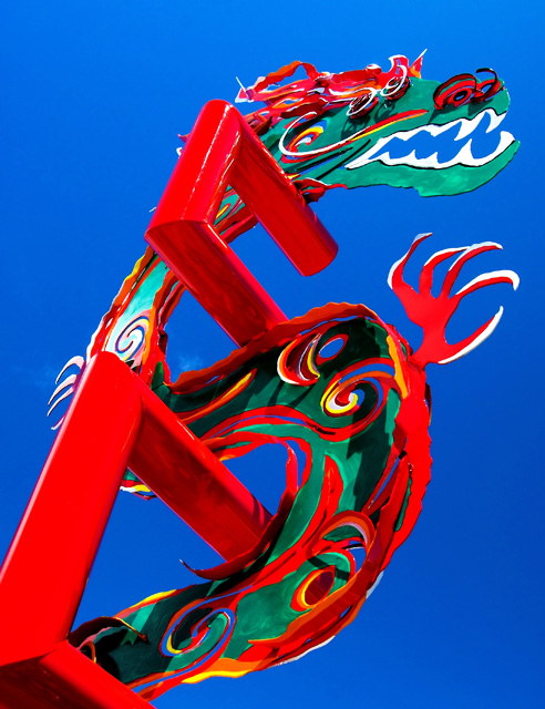
There's some loss of detail in the red channel (probably due to blowout or oversaturation) but this is a ver nice composition.
Post actions
IMHO, it seems like there is too much post processing done. I think there are too many colors too. I didnt vote though, just left comments. :)
Post actions
Post actions
Great coloring. Interesting photo.
Post actions
Post actions
cool dragon,very colorful
Post actions
Some of the most vibrant colors Ive seen in a photo in a long time-- great shot- 10
Post actions
Post actions
Meh. I don't find this very appealing. It's more blue and red than green and red.
Post actions
interesting angle. great colors. hope you do well.
Post actions
this is a good shot, it may be a little over saturated in the red
Post actions
Post actions
Post actions
lots and lots of colors here, I love the colors against the blue sky
Post actions
Too oversaturated for my taste. good composition. - 6
Post actions
nice strong use of color here except the red on the left side seems to be on the verge of being blown... as strong as this is ... you may have elected to pull back the red channel just a touch
Post actions
Wow! Holy saturations Batman! Great colors!
Post actions
Post actions
Love the colors. You probably would have done better in a different challenge because the viewer will have a difficult time determining which Complementary colors you are demonstrating. Good picture though.
Post actions
This is very wild! It looks like an artist used finger paint on a blue board. Unfortunately, Orange is the complement to blue so there is a bit of a stretch there. 3
Post actions
Contrast is red/blue, which are not the complementary colours. Those are the two colours that are evenly weighted though - and what a contrast! Good title and theme, too.
Post actions
Post actions
Post actions
Post actions
Great color saturation. The image grabbed me because of it. Nice.
Post actions
Post actions
2 - Coming across more red than orange to me, but may have been orange in person. Like the unusual perspective. Perhaps a little too 'bright' overall, not sure.
Post actions
Too many colours for my taste.
Post actions
Very nicely done, the subject is spot on. Very bright, rich colors.
Post actions
"WOW" factor for sure.....great strong impact with these colors.....
Post actions
Good comp, but too sharp. (not sure if this is red or orange.) 7
Post actions





 Add photograph to your favorites
 Add photographer to your favorites


 Photographer found comment helpful.


