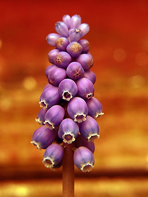
There is a bit of a color cast in this photo, which is usually the case when a lot of red abounds the frame. Scott Kelby has a section in his book, "The Photoshop Book for Digitral Photographers", that addresses this very issue using "threshold" and curves; setting the black, white and grey points. I would have liked the photo more without the color cast, and with a touch more contrast to bring out the color of purple; the red is too dominating. 3
7 - Up from 6. Like this, but guessing it's tweaked in pp, which for the Challenge, is 'fine' in my opinion... just like to have seen the natural color of the little hyacinth - apologies in advance if you've not adjusted the color. A variation in composition may have also given this a little extra, not sure, as does work well as is. Nice macro, but 'if only' a little more detail in the flowers, but difficult.





 Add photograph to your favorites
 Add photographer to your favorites


 Photographer found comment helpful.