Author Thread
Post actions
i really like this, the lighting and paper contrast nicely
Comments Made During the Challenge
Post actions
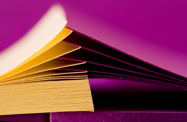
Love the idea here. I like everything except the bright sheet at the top of the yellow stack. I wonderful if you could have toned it down using shadows and highlights. (in Basic Editing not sure you can...)
Post actions
interesting take on this challenge, good use of color and the sharpness is right on
Post actions
Very creative, I wish the yellow was stronger
Post actions
Good colour choices on this image. Incredible shallow DOF is impressive. It would be interesting to see a shot with more of the note pads interlaced. This is missing a bit of the Wow factor for this to have scored higher with me. JMO.
Post actions
interesting photo. fits te challenge try boostin g the yellow a bit more
Post actions
beautiful colors and just a great photo, the purples here are awesome, this is one of my favorites
Post actions
great colour, an interesting angle, almostan optical illusion when you try to follow the lines... good light
Post actions
familiar looking but nice macro-type effect
Post actions
great DOF control. love the colors in this image
Post actions
good lighting ... good dof
Post actions
This was a neat idea, I almost did the same picture.
Post actions
Excellent.I like the lighting and the composition is really original
Post actions
The bright white in this photo takes away from the impact I think you were trying to achieve. 6
Post actions
I like this one a lot. Great saturated colors.
Post actions
Post actions
almost like an abstract.
Post actions
Post actions
6 - Like this. More finely tuned crop, especially at the bottom, more detail in the textures of the papers perhaps (as opposed to that purple 'base') and a slight variation in composition, may have made this even better in my opinion. Looks a little unbalanced overall.
Post actions
This is great. I just wish you'd cropped the bottom to where the book starts (just a slight nit-pick ;-) Good luck with this excellent image.
Post actions
this is spectacular...I hope it ribbons 9
Post actions
Difference in tone quality between the two colours detracts, IMO





 Add photograph to your favorites
 Add photographer to your favorites

 Photographer found comment helpful.


