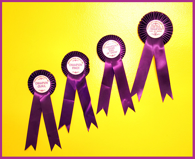
"Steps to championship" is a very good entry into the Complementary Colors challenge. I remember your shot during the voting because I spent some time reading the ribbons.
The over image is a very nice entry. Great choice of the yellow and purple for contrast, I also like your idea of having the ribbons climb it really ties well into the title. I would try to map out your ribbon placement so they are spaced out a little more evenly because you might have filled the space a little more, especially on the lower left hand side. Also I might try other lighting to balance out the shot. The flash is just a little too strong for the shot and takes away and created that funky hazy/shadow on the winning ribbon. Overall good idea. Also good idea to use the border to tie the shot all together.
You defiantly have the ideas and the skills so I always look forward to your entries, keep up the good work.
I think you had a decent concept here. The reflections on the ribbons, especially on the wording in the 3rd one, take away. If they were all perfectly straight, it would have helped as well. 6
4 - Like the colors. Better 'symmetry' and balance, 'ironing' of the ribbons, would have made this better in my opinion. Harder to read the third 'label', perhaps because of harsh lighting/flash. Ultimately, unless you do something really unusual with this, in my opinion, this shot is going to be a colorful shot of four bird show ribbons... which for the viewer does not mean the same as likely does for you.





 Add photograph to your favorites
 Add photographer to your favorites


 Photographer found comment helpful.


