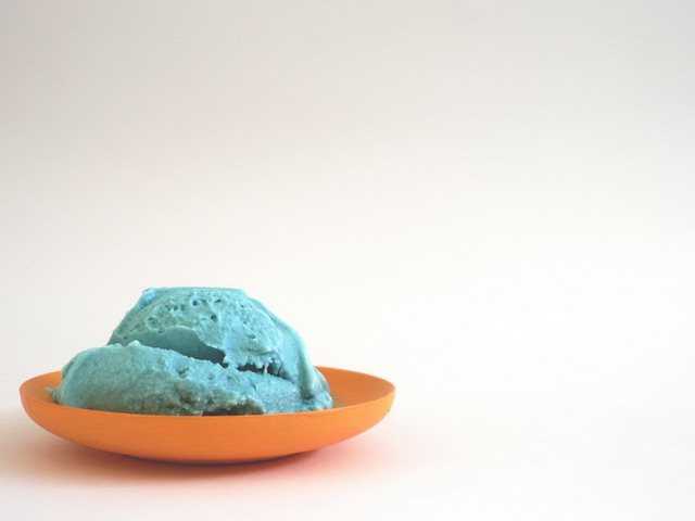
Nice use of negative space. I'd really work on the saturation and adjust the contrast for more pow. The colors are rather flat. Also, I'd take the white and do selective color adjustment to remove the black. It's an easy fix and might make the image appear more "clean."
4 - Like the concept. Looks like it needs a boost of contrast and color tweaking, also wonder if perhaps a little too much empty space compositionally, especially at the top, although not sure. Like to see more texture/definition in the ice cream, unless it doesn't look appealing to do so.






 Add photograph to your favorites
 Add photographer to your favorites


 Photographer found comment helpful.


