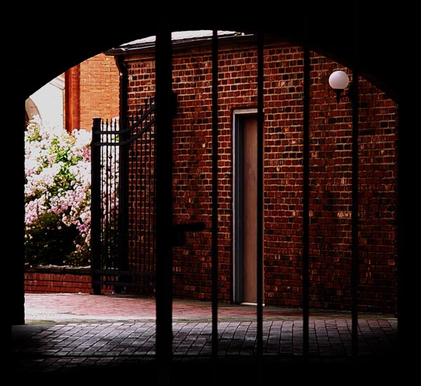
Very dark picture. May have looked better in b/w or a duotone because of the mood here. I like the spark of color on the left, but wish it was just a little more central to the composition. 6
The metering in this photo was challenging I'm sure. The dark bricks on the right with the sunlit bush on the left probably overwhelmed the camera. I wonder how this shot would have come out if somoene were standing out of view to the left with a large piece of white posterboard or something to reflect some light back into the bricks. The bars in the FG are already black but I'm thinking that will a little side light flowing into the bricks you could have stepped the lens down a little and gotten more definition on the bush and blossoms without losing any of the brickwork. 7
Pleasing colors and composition. Yes, a fill flash would have been nice, and the light on the flowers is too much on top. This photo gets a high mark from me.
I like the framing concept here - the shape of the gate opening is appealing. However, IMHO, the view through is less appealing though and somewhat dark.







 Add photograph to your favorites
 Add photographer to your favorites


