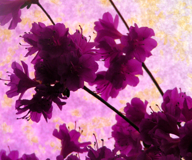
First, to get it out the way, although I didn't vote, I'm one of the people who thinks there is definitely too little yellow, and what yellow there is seems rather arbitrary rather than an integral part of the composition - I wouldn't have voted it high in this challenge.
Other than that, I think the main thing that hurts the photo is the lighting - its very hard to make out any detail in the flowers, especially those facing us, and the purple is very flat. I'd suggest trying to light from the front a little, at an angle, just experimenting to see what enhances the tones & shapes in the flowers.
The diagonal composition works well, but it does seem veeeery busy - I guess thats partly a characteristic of those particular flowers, but I'm sure it could have been made a little less busy by arranging them differently or even breaking of some of them flowers. Simple compositions nearly always work best.
Beautiful purples, but the complementary yellow color seems too washed out. I haven't read any other comments yet, but I suspect "focus" issues predominated. This would have been better, I think, if the yellows were more obvious and the flowers were more sharply focused. I like the composition. Nice use of diagonals.
Trading Post comment
The composition here works for me, even though some may say left to right is more appropriate - I'm kinda fond of right to left. I especially like just the touch of yellow along with the proliferation of purples. I suspect what really hurt your score was the lack of focus on the flowers and the underexposure of the ones closest to the viewer.
I think this image has potential, even though it scored so low.
the balance between purple and yellow is perfect, yellow is a very dominant color and has to be used with caution, but what I find wrong is the lighting, there's just too much shadow in the flowers, but not enough to make it look like it was intentional.
since this is a flower picture people want to see all the fine details, but your aperture is way to big to show any details, try shooting again at f8-f16 and use a tripod, and try using ISO 100. just lower the speed to compensate. I think the image would pop out and be really nice just by increesing the DOF.
sorry, but i beat this one down. probably more of a me thing than anything else. i did not think the soft focus mixed with the bright (backlit?) flowers. i thought those should have been the whole point and that they should have been spot on. it seems the background was the whole point now that i am looking at it again. i say the bg was the point because that is where the focus seems to be and that is where the actual complimentary colors seems to be.
it seems that this would have worked better, imho, ifn you were to leave the flowers (sharp) and have just a yellow bg. maybe. i also think that maybe ifn you would have flipped it (so the diagonal went from bottom left to upper right) i think i heard that is the way the natural tendancy for the eye to veiw the frame. unsure about that but i am pretty sure that is right.
It's a tad lacking in focus, both compositionally and photographically. I can see how the flowers seem to be growing from the direction of the lower right corner to the lower left. Perhaps if you had pulled the frame back a bit to show more of this, the effect would have been better. As well, the complementing nature of the colours isn't effectively emphasized with the background you selected. Pretty overall though. :)
This didnt work well for me. The focus is not good and the colors are oversaturated. Just not enough detail in the flowers and the background is just too distracting and odd. The actual setup and placement of the flowers works - good angle and empty space around - but not enough to give it a better score. (I hope that didnt sound too harsh - just my opinion).
I think I see what you were trying to do here, but the yellows just didn't do a good job of complimenting your purples. Stupid yellow :) It seems that in a photo where the shape and details of an object are intentionally hidden, the colors have to be really perfect to make up for it. The purple is rather dominant here, almost a color cast, and the yellows just aren't working. Composition is tough to judge, because it looks a little bit "random", but the stems cause me a little confusion. I wish I could offer better advice on how to make this kind of thing really kick, but that's about the best I can do :)
--Trading Post Comment--
Great concept, but I think that it needed a bit stronger yellow background to really stand out in the challenge. With the lighting, it is also hard to pick out one area of crisp focus. I think that is was underexposed from the start, and curves could only amp it up so much. I do like the flowing composition that you created. It definitely serves to lead my eyes around and through the frame.
5 - Nice and good potential. More yellow, especially to 'complement' the 'purple' of the azaleas, make this better in my opinion. Also looks a little too close/blurred and possibly a bit of grain. A more refined crop would also have likely given this a little extra, again in my opinion.





 Add photograph to your favorites
 Add photographer to your favorites

 Photographer found comment helpful.


