Author Thread Comments Made During the Challenge
Post actions
Purple and yellow are complenentary colors. I think different lighting would have helped bring out the detail in the petals.
Post actions
Background is too bright, it detracts from the flower.
Post actions
Color of flower is very uneven. Probably you added too much contrast or saturation.
Post actions
Post actions
Colors look too washed out, which is affecting the details of the flower.
Post actions
Post actions
doesnt fit the challenge.
Post actions
good shot but no complementary color
Post actions
I think this is a very nice photo :)
Post actions
It's either my monitor is off or these are not complimentary colors. Yellow has violet and this one is red.
Post actions
really like the colors, but the pollen on the petals is sort of distracting
Post actions
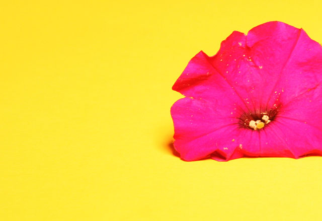
I'm guessing that many have commented that this shot has missed the complementary colour based on colour theory. On my calibrated screen I see yellow and pink. Perhaps the processing changed the flower from purple to pink? JMO
Post actions
Post actions
Funny colours. Looks like wet paint.
Post actions
Post actions
its suppose to be purple and yelow not pink
Post actions
too satured in my opinion
Post actions
2 - I'm seeing hot pink and yellow here, with beginnings of red. A hue adjustment (although realize that is likely what you've done, especially by the look of the yellow stigma), may have helped this. Color/contrast of the flower just too harsh in my opinion. Variation in composition/crop as well, not sure. Too much detail in the flower is lost, again my opinion. Realize this may all have been intentional though.
Post actions
Post actions
Oversaturated -- all detail of the petals have been lost.
Post actions
Yellow and purple are complementary colours, not yellow and pink. Focus seems a bit soft on the flower.
Post actions
This is a bit over-saturated for my taste.
Post actions
Looks pink and yellow here and maybe a bit oversaturated? Interesting composition, though.
Post actions
great colours...would have liked the bottom petals to be open and not tucked underneat





 Add photograph to your favorites
 Add photographer to your favorites


 Photographer found comment helpful.


