Author Thread
Post actions
Comments Made During the Challenge
Post actions
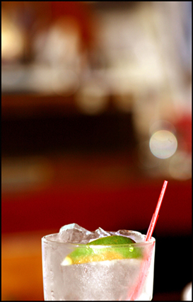
Nice bokah...It enhances the image, for once, instead of detracts from it. Good job!
Post actions
most of your photo is useless, as in the dead space doesnt add to the photo, and you have to look for the colors. its like a prof havingto look through your answers to se eifhe cna give you a point or not because you cant write it clearly enough.
Post actions
Kind of vague. And I can't tell if the green is contrasting the red straw or the red backround. Good DOF though!
Post actions
the emphasis is not on the colors
Post actions
this might be a bit of a stretch but love the bokeh ;)
Post actions
interesting, but a bit small
Post actions
Too many distractions in upper half of photo, otherwise lovely idea
Post actions
Post actions
Ouch, this hurts a bit... It leaves a little bit to be desired. Nice try though.
Post actions
lacks interest, the reflections on the glass are too harsh
Post actions
Post actions
would be bettre if there wasnt so much dead, blurry space.
Post actions
Post actions
2 - Looks like good potential. Bigger (640), an angle to allow the lime/green to be more dominant, all have made this better in my opinion.
Post actions
Mmmmm, gin and tonic. Extra points for being extra tempting : )
Post actions
the DOF is good herebut i would have liked seeing a tighter crop so we can see the matter better.. do you read me :) well done tho
Post actions
too small to judge properly
Post actions
too much white (crystal) between the two - complementary element is not obvious enough for me. The white circles (bottom one too) are too distracting. 7





 Add photograph to your favorites
 Add photographer to your favorites


 Photographer found comment helpful.


