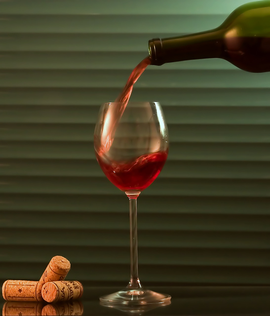
Nice potential in this composition but there are several things that would make it better: the angle of the glass to the background is not square, should be perpendicular; the contrast and brightness need boosting. The light on the corks appears stronger than the rest of the image, try to achieve more uniform lighting.
Really like this, the color and contrast of the blinds really accents the subject, but the angle of them vs. the angle of the table is distracting to me.
I'm not sure the centered subject is doing your photo justice here. I like the idea and setup, but think you maybe could have cropped off a little more of the right side.
A good idea. The background is rather distracting. I think maybe, in order to include the corks, a larger overall crop would work. As it is, it's a little hard to look at all three subjects in the photo.
I am sure some people are knocking you for the angle of the blinds not being completely horizontal...nit pickers :) I really like the way the wine glass almost seems to be floating and I don't know what the reflected light on the glass is but I also really like that too, it adds a good sense of warmth to the picture.





 Add photograph to your favorites
 Add photographer to your favorites


 Photographer found comment helpful.


