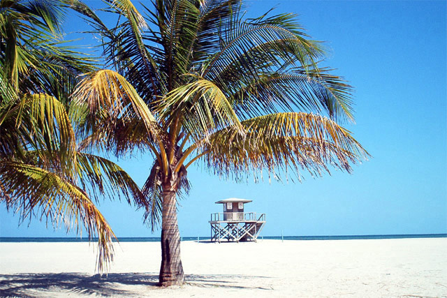
Nice shot! Maybe you did it on purpose but I think less DOF would be better. Either focus on the palm trees or the building. Anyway. The photo captures a very serene mood :-)
A bit too bright. Also, I might have tried shifting the tree to the left a bit, and left "dead space" to the right (assuming you had room in your crop). Might have imparted a more exotic feel.
Gorgeous and deserted. How lucky are you? My only suggestion would be to have taken the picture a few more feet to your right. It seems a little unbalanced to me because the building is right under the tree limb, and there is nothing in the right 1/3 of the picture (except beautiful white sand, blue sky, etc.).
i wouldn't mind being there right now. overall, i think the shot could do with just a little bit of gamma reduction and less brigthness. that way, the beach has a little more texture to it and it nost so almost-white. -- gr8photos (5)
Like a postcard, which is good and bad. It's a safe image...and technically well done... doesn't give me enuf of a reason to stay and look at it, however... maybe it needs more water.. or a person... or more striking shadows... or something 5 sjgleah
I'd love to be here. The colors on this are beautiful. The blues of the sky and the blue of the water against the white sandy beach....sigh. If you live here, you are lucky. 9 - KDJohnson
I wanna be here now !!! Good subject ... Looks a little washed out and maybe a tad too much sharpening ... Maybe a little out of focus on the sand ... Still I like it ... 8 ... RLS
a bit too centered - if there was nothing to the right of this, it might work well with the tree on the far left, the hut on the left and then some open space ?
really really nice colors. The sand looks just a tad over-exposed in some places, so you lose some nice texture. I really like the shot, though. I feel serene already!
Beautiful ! A polarizer filter would really deepen the colors into that rich tourist/travel guide effects you see. Maybe even get a bit of that with PhotoShop levels. PERFECT crop !
I know it's tough to get everything exposed correctly on a shot like this, but I think I'd like it more if the sand was exposed correctly and the trees were a little dark. Also, the horizon isn't level.
Frank: Serenity nowww! One of my favs!! Lovely shot with great color. It's speaking peace serenity, quiet, calm. The blue is good and very calm. Nice shot. Maybe next time try this same shot only down lower. Kee
Nice shot. I like the composition of the beach and sky, but might have tried getting a different angle so the lifeguard tower wasnt right in the center.







 Add photograph to your favorites
 Add photographer to your favorites


