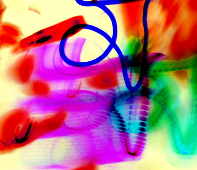
Wow, this is a tough one. The various colors in the photograph work very well together, but no one subject really jumps out to capture the viewer's full attention. When shooting for these challenges, you really have to consider how much time the shot will be viewed. On this site, you need a crisp image that dramatically grabs the eye right away. I believe that this one would make a terrific, wall-hanging enlargement, especially if paired with its positive image side-by-side, but its not a shot that typically does well in these challenges. It is very busy and, outside the harsh, blue line, I really can't tell where the area of focus initially was. The camera movement provide some very interesting and uniquely similar shapes. The shapes serve somewhat to move the viewer's eye around the frame, but the chopped off shape curves seem more accidental than an intentional capture. It no doubt meets the challenge, but the positive would have probably been received just as well. As was stated earlier, this is great for an abstract art piece, but lacking interest for a photograph.
This is just really abstract...and a lot of the time things that are abstract aren't so 'widely popular' or all the 'pleasing to a wide audience' -- it's a fine piece of art, but those things are just not usually received well by the voters.
Without the blue line I think it would make a fine abstract, though maybe a bit cluttered. The blue line doesn't seem to serve any purpose since the texture and opaqueness (?) of the colour don't seem to harmonize with the rest of the image.
Sorry, I am not a fan of abstract work and this is no exception, this does absolutely nothing for me so I threw a 3 on this. Figured you deserved an explanation for the low rating.






 Add photograph to your favorites
 Add photographer to your favorites

 Photographer found comment helpful.


