Author Thread Comments Made During the Challenge
Post actions
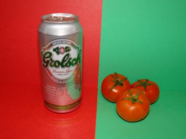
The tomatos are very clear. Need more clarity on the can. Great colors.
Post actions
Post actions
good idea, some problems with focus.
Post actions
the colors are certainly complimentary but better focus on your subject is needed.
Post actions
This almosts works except it's not cropped nearly tight enough and is out of focus.
Post actions
Composition needs work. Didn't care for the straight line dividing the colors. Also focus was way too soft.
Post actions
Post actions
definitaley not healthy :)
Post actions
good idea, but the can is somewhat out of focus
Post actions
Post actions
Post actions
better focus on the beer would have been a great improvement
Post actions
I like the concept but the line between the colors make the photograph seem tilted.
Post actions
Post actions
Good idea but out of focus. Also the line between red and green is not straight.
Post actions
wow... I am not on board with this image not really sharp at any point also seems out of scale
Post actions
The image is not in focus :(
Post actions
The beer can focus appears to be a little soft. I like the original idea.
Post actions
the can is a bit out of focus and the dividing line could be completely vertical
Post actions
This could be better if it was in focus.
Post actions
definite focus problems...just doesn't work
Post actions
There is nothing wrong with your concept. It is a good idea. The technical execution of this image is its main fault. It lacks clarity and has some serious digital artifacting in the composition. Overall color and contrast are weak. You might consider shooting this from a different perspective, like from ground level or straight down from above with the red-green boundary absolutely horizotal or vertical in the frame. This is kind of a "snapshot" perspective.
Post actions
focal issues hurt this ... it is oddly interesting though
Post actions
A bit blurry - sure complementary colours, though.
Post actions
Post actions
Nice idea, but the lack of focus is very distracting>
Post actions
the picture has too many artifacts.
Post actions
good shot
Post actions
1 - Meets the Challenge mostly color-wise, but the concept, subjects and focus/quality, not holding my attention.
Post actions
The Grolsch... is a little blurry, but a good plan. 7
Post actions
Out of focus, center line is leaning, you can see the seams of the cardboard and object don't really relate to each other which does not help to show contrast to the viewer.
Post actions
Nice idea and good colours.
Post actions
would like to see the can in better focus
Post actions
DOF seems a little off and the reflections in the can are a little distracting.
Post actions
an out of focus photo of two unrelated things is what I see...sorry, this is poor





 Add photograph to your favorites
 Add photographer to your favorites


 Photographer found comment helpful.


