Author Thread
Post actions
Comments Made During the Challenge
Post actions
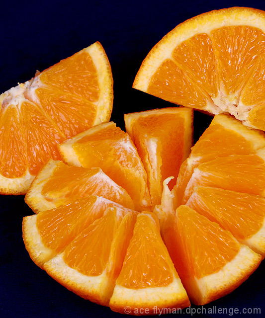
At first I didn't notice the background was a very dark shade of blue. I take it not everyone will see that. Shame because this is a very good photo. 9!
Post actions
I can taste the orange. great photo!
Post actions
where is the complementary color??
Post actions
Really great photo. Looks good enough to eat.
Post actions
Great, great image of an orange - it looks good enough to eat. But where is the complimentary colour? Such a shame, the sharpness and composition of this are very good.
Post actions
Cool orange, but I don't see the contrast. The background is not blue enough!
Post actions
Looks delicious. Nice lighting.
Post actions
Post actions
Post actions
doesnt meet the challenge
Post actions
great picture but no complementary color for the orange (at least on my screen)
Post actions
You have captured the flesh of the orange very well! The surrounding colour looks black but I can see shades of blue at the bottom. Good luck.
Post actions
you forgot the purple unless the background was supposed to look purple but great detail
Post actions
wheres the compliment? Blue?
Post actions
On my monitor the background is practically black. Really had to look to find the blue.
Post actions
Good composition and lighting.
Post actions
I see a lot of orange but no complementary color (blue), so sorry DNMC.
Post actions
Great set-up/composition but I'm not sure how this fits the challenge unless my screen is too dark and needs recalibrated again.
Post actions
I like the composition and lighting, but the background is too dark.
Post actions
Post actions
The blue is too dark - I'm viewing on a laptop tonight (a very good laptop, but still!) and I had to adjust my viewing angle to catch the navy.
Post actions
Where's the complimentary color?
Post actions
One of the best pictures of oranges that I have seen in a while, but where is the complimentary color?
Post actions
Post actions
Erm... What is the other colour?
Post actions
Where is the complementary color? blue/yellow; red/green; purple/gold???
Post actions
cool composition but doesn't meet the challenge requirements
Post actions
Post actions
5 - Good detail and color in the orange. More blue and not so blotchy in the parts of the blue that are visible, make this better in my opinion.
Post actions
The complementary blue isn't very evident. In my monitor it looks almost black. Other than that, I think this is very nice. I specially like the way the half orange is cut, it creates interest for the eye. Very clear and well-balanced.
Post actions
At least on my monitor, the background would be better if lighter to emphasize the complimentary colors.
Post actions
Post actions
if you had made the blue more blue so i could have seen it was blue right away you would have gotin a 8 from me. but you didn't so i will have to say 6 sorry
Post actions
I see orange, and it looks amazing, but what is the complementary colour? would it be the black?
Post actions
Great image of the fruit, but where is the complimentry colors.....
Post actions
not much to see of a complimentary color, but technically goo shot
Post actions






 Add photograph to your favorites
 Add photographer to your favorites


 Photographer found comment helpful.


