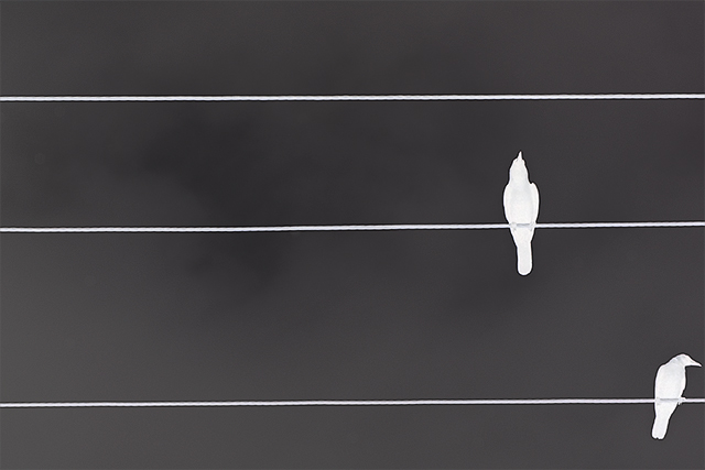
Very clever title. I think this pic is really cool. Many other pics in this challenge seam too crowded, and are difficult to piece together. I like the simplicity of this, although I don't know if I'd rather have the crows completely white or with a bit more detail... they're somewhere in between detail and complete blow out now.
I like the simplicity a lot, but I would have leveled the lines (which is okay in basic). I also think a touch more space between the outer bird and the right edge would have helped. 7
Very minimalist, I like tit. Just think the crow to the right could have been just a small amount more in the frame, not so close to the edge of the photo. Anyway, like it, gave it a 7.
Great composition. It might be just my eyes but it looks like the wires slant down slightly from right to left. An easy fix with rotate canvas arbitrary. Having the lines exactly would further contribute to the graphic feel you have so nicely established. Along the same lines, (no pun intended) I would like to see this with the contrast pushed even further so that the background looked more black and the birds were truer silhouettes. Just a few ideas. Great job. 9
I think this is a really cool theme and the image works nicely as a negative... compositionally, I think it's a tad weak with the lower bird being too close to the edge of the frame... nice work though :)





 Add photograph to your favorites
 Add photographer to your favorites


 Photographer found comment helpful.


