I see you never received the Critique you requested so here I am, hoping to fix that! :)
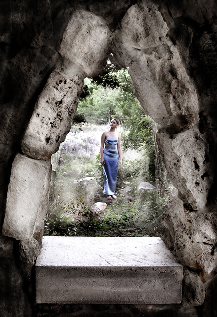
This is a lovely picture, I love the mood, the tone, the feel. You said you did lots of dodging and burning and I think some of the dodging might have hurt you a bit, as in you did a great job on the rocks that make the window but the dodging around the model is very noticable and there are lines everywhere around here. I'm betting if that wasn't as noticable you would have been a contender for a top 10 easily. The model is nice, a type of cloak would have completed the picture perfectly. If you redo this, take away some of the dodging around the model I would love to see it!
I hope my comments help and Good Luck in future Challenges!
It's really unfortunate that a lot of photographers don't bother to fill in the "Photographer's Comments" section when they submit a photo to a challenge... especially when they check the box to request an in-depth critique. I have stopped offering in-depth critique on photos when the photographer chooses not to include his/her own thoughts on the image when they submit it... You might want to consider this in the future.
Pretty cool, yes, very medieval and mystical, I like it, only thin is that her dress doesn´t really fit the rest of the shot, would have been cool if you had her in an lord of the rings kind of elvish white gown but that is just nitpicking. 8 from me, great shot.
I like the idea, but I think the model should have been a little closer to the window so she would fill the space better. It also looks like the dodge and burn tools were used agressively (at least on my monitor). In any event, the lighting is unusual.
Really nicely done, love the idea, good composition, the blue dress works against the background, it really seems like a window into another time. Good luck
Really like this shot. I would have loved to see a little bump in saturation on the grasses surrounding your subject, that to me, would separate the desat of the foreground. Love the window shooting from and the total concept overall. 7
Nice composition and use of lines here. Your decision to desaturate the photo was a brave one, but works well in this case to move the focus towards the textures and lines... 7





 Add photograph to your favorites
 Add photographer to your favorites

 Photographer found comment helpful.


