Interesting to do a critique on your image but it is difficult if you don't give us any information in your photographers comments. When we do a critique, we go past just the photographic result, that's what voters comments do. The critique looks at what you were trying to achieve, how you wanted it to look and what issues you had in getting the image captured and ready for voting.
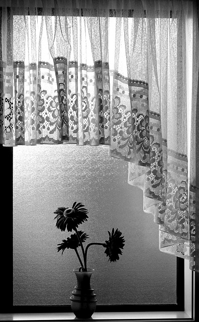
First Impression - the most important one: Well thought out shot .. seems to be playing on the sillouette .. but I don't think it quite made that ...
Composition: Not centred ... which I like, I like the drop of the curtain .. looks like the glass in the toilets over here in NZ ... but who cares I am surmising ... the composition it self works well for this shot.
Subject: Meets the challenge with all the kiwi ingenuity.
Technical (Colour and light): I know lots thought the black and white worked .. but I am not sure that it does with the use of only backlighting ... unsure really ... I like the silouette type feature and feeling to this shot.
To grow its vote?: You already know how to ribbon and do better .. but just keep doing really ..
Summary: Love to see you still doing fantastic as always .. been interesting having the critique what i think is one of our own.
If you've got any questions about this critique, please feel free to contact me via the PM system.
This is underrated. I thought this was great. I'm guessing if you catered this more to the DPC crowd and kept/made the flowers colorful this would have scored much higher.
Lovely! I really like this done in black and white. Some may say that you should move the vase slightly to the left but I find it very well balanced where it is, due to the shape of the curtain and positioning of the flowers. The only nit is the slope at the top of the window frame - this could be cropped just below it, or use post processing to correct the perspective.





 Add photograph to your favorites
 Add photographer to your favorites

 Photographer found comment helpful.


