Oh boy! This is sooooo last minute! I am in Seattle right now and for the past couple of days, I have been trying to search for a photo that I could enter for this challenge. This was shot just before dinner tonight, Sunday! I have a few window shots of Seattle but decided not to enter them as most folks know that we just had a mini-Seattle GTG so any Seattle imagery would be narrowed down to a few entrants.
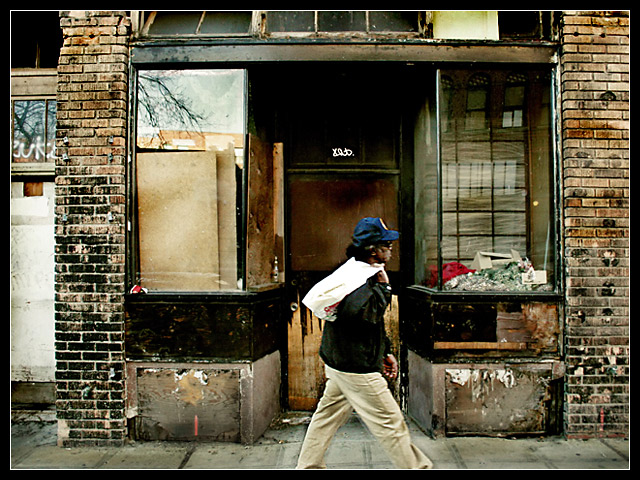
This image was taken along 7th street in the International District. I was initially just shooting the old decrepid storefront windows but then with sheer luck, this homeless guy just happened to pass in front of my shot. So I decided to enter him instead to give it a sense of scale and proportion. This entry might be somewhat outside the norm of what the voters are looking for but it's a brand new editing style for me.
Shot in RAW and processed with RSE. Used the Dragan filter and burned the brick to add more depth and shadows. Slight USM and no NI on this shot folks. Cropped to 420x620 with a 1 pixel white stroke. Enlarged canvas size to 640x480. Saved for web.
This image might come out weird which I hope it doesn't. I have my laptop and I am not too happy with the screen resolution and contrast ratio :( Oh well. No choice for me at this point. Let's see how it does in the voting shall we?
IMG_4855.CR2
Statistics
Place: 128 out of 180 Avg (all users): 5.1992 Avg (commenters): 6.1250 Avg (participants): 4.7500 Avg (non-participants): 5.4575 Views since voting: 1697 Views during voting: 377 Votes: 241 Comments: 21 Favorites: 0
OK, im not gonna lecture on and on about how to score well on dpc, because apparently you already knwo how to do that ;)... (something most of us can't do). But ill try and focus on what i think could make this photo better, not from the dpc viewpoint, but from my personal view.
First off i think the editting on this is a little bit harsh. Either too muchincrease in contrast or a little crazy with the curves adjustment, I would tone it down a little bit.
The noise in the photo was also a little bit too strong for me, i would tone it down a little bit, im not sure if this was a desired afffect, but i do think that noise in this pic would look good, you just had a little too much.
Considering you were using a laptop with a bad screen a coomend you on your post processing. Although sometimes rush images are the worst images to enter...
Just keep in mind that even though the update button is addicting, its good to kick the habit... :)
hope i helped a little, if you have any comments or questions please feel free to PM me
I thought this would score a little higher. I really liked the processing, the guy walking, and the dirty old buildings. I'm pretty square so might have suggesting cropping LH side to leave the brick pillars framing each side.
Hey....it might not be your best score...but it was also a challenge that really threw a lot of people....don't worry about it too much Rikki...and look forward to the next challenge.
Frame the subject of your photograph using the window (as in from a building). You could almost argue here that she's framed by the door. Just. Any reason for placing her just right of centre?
This is the kind of street photography which screams for a good black and white conversion. There are so many details, patterns and texures in this image which add to the composition.
This is very, very good. Framed by windows! So refreshing to see an image that's not a slave to tedious bloody literalism. And it's an interesting, ambitious image, too. Not content with thumbing your nose at the DNMC literalists, you say "screw you" to the composition police as well. How do I love the? Let me count the ways! (EBB) 9.





 Add photograph to your favorites
 Add photographer to your favorites

 Photographer found comment helpful.


