Author Thread Comments Made During the Challenge
Post actions
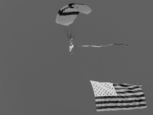
It's a little washed out and lacking contrast in positive, which makes it a bit dull in negative.
Post actions
Post actions
Great choice-- the flag looks very cool reversed-- 9
Post actions
This might have more impact if you had inverted a colour image, not a B&W one.
Post actions
Nice but the sky is a bit bland, think this would have been cooler in colour than in b/w.
Post actions
Post actions
A different composition/crop might give more impact.
Post actions
Post actions
cool photo yes, but inverting it barely changes the picture. i think inverting such a well known symbol like a flag takes away from the picture because it's immediately obvious that the photo has been inverted.
Post actions
HUmmmm, Army Parachute Team. I watched them at Ft Sam this week, great capture, we must have been standing right next to each other.
Post actions
I'd like to see the colour version of this. As it is I find it a little drab. Also the compositon could do with being a little more interesting.





 Add photograph to your favorites
 Add photographer to your favorites


