Hi, my name is Kari and from the critique club.
Interesting to do a critique on your image but it is difficult if you don't give us any information in your photographers comments. When we do a critique, we go past just the photographic result, that's what voters comments do. The critique looks at what you were trying to achieve, how you wanted it to look and what issues you had in getting the image captured and ready for voting.
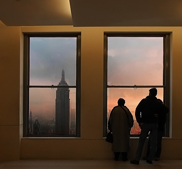
First Impression - the most important one: Lovely, nice framing of the people against the window ... lovely colours.
Composition: I think this really works for this shot ... with the people on one side and the tower in the other frame it gives it a real balance.
Subject: Meets the challenge with added flair.
Technical (Colour and light): I like this .. it is a little 'dull' in some ways e.g. not bright colours but oh so appropriate for the shot.
To grow its vote?: Top 25 .. is great ... and this is a good solid shot .. I am not sure how to get it a higher score .. but take a look at the top ten .. what do you think is missing?
Summary: Great shoot .. you are doing really good stuff .. keep it up.
If you've got any questions about this critique, please feel free to contact me via the PM system.
If you could've moved yourself to the left a bit to center the building a bit more in it's window, it would've been nice, but only you know if that was feasible. Nice colors.
Very nice. the golden; tones of the wall are similar to the sunset color. I like how the two people are balancing INSIDE, the building that we are seeing in the left window OUTSIDE. Nice job.
A good composition and a nice mood. The people are a bit oversharpened. I like the blending of natural and artificial light, composition is nicely balanced. Good work.
Wonderful colours, particularly the inside walls. I'd have crouched or raised myself on tiptoes to place the building on the left (Empire State?) better. The silhouettes could be more effective... perhaps a couple in profile?
This is one of the best entries in terms of making the window really integral to the shot - rather than included as a border/ frame or just to meet the challenge. I like how one window showcases the view and the other silhouettes the people who are looking at it. Colours are lovely, lighting is great. It looks oversharpened to me though perhaps that's just haloing from the light.
This has got all sorts of brutal sharpening halos, and I don't care at all. I like the whacky, interesting composition, and I like the effect created by the processing artifacts ... as if the image is created by "cut-out" primary components, but balanced with beautifully subtle secondary details (sky and city background). Bold and pleasing. 8.





 Add photograph to your favorites
 Add photographer to your favorites


 Photographer found comment helpful.


