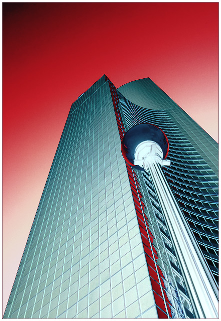
This is going to be a weird challenge. I'm a little concerned that people aren't going to like that this is an "altered" negative, but I think it gives it much more kick and am hoping to separate myself from the others. Either I will separate into a 6.5 or into a 4.5.
Taken before the Seattle GTG of the Columbia Tower. The biggest alteration (after inverting) is to do a pretty drastic curve application on it. Then I did some further color balancing, hue/saturation, and selective colors. A final USM and a border (opposite colors naturally).
Statistics
Place: 5 out of 438 Avg (all users): 6.8238 Avg (commenters): 8.2727 Avg (participants): 6.8605 Avg (non-participants): 6.7755 Views since voting: 4495 Views during voting: 349 Votes: 227 Comments: 51 Favorites: 13 (view)
Outstanding finish doc and just a titch below my prediction... no worries... can't complain about the finish and of course the perfect image added to your collection... :)
this is really good, i like the crispness of this, all the way to the top. The colors are intense and the angle of the building brings me into the pic. 10
Great title, how true! Looks like a landscape on Mars!!! Very effective negative image, I also like the leading lines and the perspective on this enrty. Well done and good luck. 9
Very cool great angle and composition. The inverted colors are great. I really felt that something that was more graphic art in nature would perform well in this challenge, and look what rose to the top(IMO). Well done!
DARN DARN DARN. I am never going to win a ribbon if people like you keep submitting captures like this. This is fantastic. I love architecture and you let me see it in a new way. The colors are perfection. I know you did not have a big hand in that other than realizing that you could share this with the rest of us. Also your composition is spot on. The sphere of the lamp in the foreground almost looks like it was meant to fill the cut out in the rooftop of the structure. 10 Have to add it to my favorites!
Went back over all my votes. Only 10 I gave. Great Great Eye!!
dc
Only voted on 20% in this challenge, and am coming back to comment on a few. This one is the best I have seen in what I voted on. The reds and blues harmonize perfectly. That and the effective perspective could leave you with a big smile at rollover time :)
Great lines and colors. Nice to see some vibrant red in the challenge. Very nice that you have no clouds in the sky. The color blending in the sky works really well.






 Add photograph to your favorites
 Add photographer to your favorites

 Photographer found comment helpful.


