Author Thread
Post actions
Post actions
This should have placed much higher IMO--
Comments Made During the Challenge
Post actions
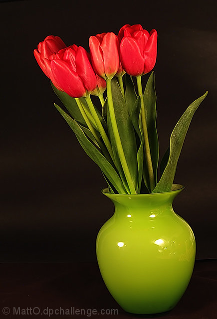
Nice composition! If I were to change anything, it would be the light reflections off of the vase.
Post actions
Love the colors and the dark background.
Post actions
One of the better flower shots here.
Post actions
I like the dead black background. The lack of visible means of support (tabletop, shelf etc) is a bit disconcerting.
Post actions
Post actions
very bright, good contrast
Post actions
Another great "Studio" flower shot-- so clear and sharp-- 10
Post actions
good shot the the shot is tack sharp
Post actions
needs interest. title doenst add any to the photo and viewer is bored. but nicely shot (focused) needs better lighting try a polariser.
Post actions
This seems a bit tilted to the left.
Post actions
Post actions
Just beautiful. Does the vase look tilted toward the left??
Post actions
Post actions
When shooting glass (or a reflective surface) you may want to put up a screen between the subject and the glass to conttrol the reflection (right side of the vase)
Post actions
Post actions
the flash/light on the base is just a tad distracting to me.
Post actions
I really like the color choice for the vase and the flowers. Found myself tilting my head as the vase is leaning to the left. My eyes keep going to the hot spots on the vase. Overall, I enjoyed looking at the concept.
Post actions
better if the two main areas of colour were not at opposite ends of the picture
Post actions
A green Vase would probably have fitted better.
Post actions
I wish there weren't any reflections on the vase
Post actions
Post actions
Nicely done! A bit too much glare but good lord, lighting reflective things is such a pain that I definitely understand. The lighting otherwise is very nice.
Post actions
Nice framing and vase works well, but you need to work on the lighting to get rid of the reflection. Also could use more light on the top of the tulips.
Post actions
Vase slightly tilted, but nice soft colors.
Post actions
Post actions
One of my personal favorites, but could have used a slight rotation. 9
Post actions
nice and simple and well done
Post actions
4 - Nice concept. Looks crooked. A more uniform or varied base and background/drop and possibly also a better arrangement of the flowers (unless this is intentional) make this better in my opinion. Less glare on the vase too. Colors are good in the flowers, including the match up of the stems with the vase.





 Add photograph to your favorites
 Add photographer to your favorites

 Photographer found comment helpful.


