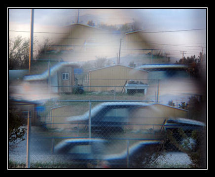
This image was taken through the little decorative window on my front door. The darkened triangle is actually the metal between the glass pieces. Not sure how it turned out looking like this... the clone effect without an editor... I thought it was cool.
Statistics
Place: 170 out of 180 Avg (all users): 4.4017 Avg (commenters): 5.0000 Avg (participants): 4.1818 Avg (non-participants): 4.5298 Views since voting: 1062 Views during voting: 399 Votes: 239 Comments: 17 Favorites: 1 (view)
Hi, in case you were wondering the critique club is a coupla people from dpc who voulunteer to give somewhat in depth critiques of people challenge photos. We try to help... :)
Ok, now to the photo.. generally on dpc, the rule of thumb is if the image looks blurry, seems blurry, has a little bit of blur, and doesnt use neatimage... it not going to score well. Although you may look at this photo and say oooo i like the blur and the affect clone affect, you have to step into someone else's shoes and think how they think... critique your own image.
Technically this image is ok. The crooked lightpole detracts from the image as a whole. The thing that bothers me most about this image is the lack of negative space. Negative space is the area in the photo where there isnt really anything of interest. This photo seems really busy. You also must consider when doing photos for dpc that looking at an image at full size and looking at it at 640 pixels is totally different. Also rememeber that when you resize, you lose deatail and sharpening. I tend to do my sharpening after i resize, i just open up the pic and do it then.
Hope this helpes a little bit...
if you have any comments or questions please feel free to PM me.. :)
i used to shoot through beveled window alot i like the affect of it focusing through them and such....however this is a very small image as posted and it doesn't have the best choice of subject....would've been pretty with a flower on the otherside in the center...
Sorry but the effect, whatever it is just gives me a headache from looking at this picture, I just want to click "3" and move on to the next photo. Just thought I should explain the low rating.
this is creative, I like it a little bit.. not one of the best in the challenge, but not bad.. it had me looking for a while so that must say something...
Nice effect, but the corners of the photo aren't particularly inspired. With some more vivid colours and more interesting subject matter this effect could look great.






 Add photograph to your favorites
 Add photographer to your favorites

 Photographer found comment helpful.


