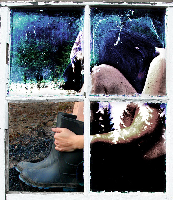
It's bloody cold running around the yard in the nudd.
Photoshopping:
Lens Correction
Crop
USM
Levels
Select (3x)
Hue Sat (4x)
Bright/contrast
Burn
-------------------------------
thanks for all the wonderful and helpful comments - it's nice to get constructive criticism too. the lower left pane has no glass in it.
i nearly didn't submit this. when i stopped fiddling with it, i steped back back and went - o my god, this is too over the top. mentally i'm still very much a straightforward street photographer - weegee etc. so all this post processing still seems a bit too much for me.
but, i think i like it...;-)
Statistics
Place: 35 out of 180 Avg (all users): 6.1255 Avg (commenters): 7.2973 Avg (participants): 5.7889 Avg (non-participants): 6.3185 Views since voting: 5718 Views during voting: 523 Votes: 247 Comments: 50 Favorites: 20 (view)
I understand your feeling with the new post process era, but it has good points and bad points I guess. In this case your artistic taste, and coordination make it a lovely image. A couple of things I like about the photo are the colors, and creativity. I love the colors you set in, and the imagination hits overdrive when I look at it. There is another thing about this photo I can't quite explain. Its the ability to hold my eyes, when I pass over seeing it tends to hold my eyes, I want to study it, look at it, learn more about it. Maybe just me, but I welcome it, and I thank you for posting.
Very artistic! Love it! It made me stop scrolling and contemplate for a moment. I didn’t vote in this challenge but I would give it 10. The picture goes to my favorites.
First Impression: God, the PP on this shot f-ing rocks. But guess what? The title f-ing rocked more! I don't know if you got it from the bible (1Cor 13:12) or from the movie (Såsom i en spegel) or wherever, but such photos with such titles make my day. 10. No, 11.;p
Composition: Minus minor nitpicks, I would have it no other way. 9.
Subject: Hey, I just realized I'm not too wild about those boots... damn. I think I would've liked it better with naked feet. Eh, whatever... it still rocks. 8.
Technical: Spot on exposure, IMO. Blown-out window borders worked for me. 8.
Improvement: Remove those goddamned boots! Hehe. Besides that, nothing from me.
Summary: How do you youngsters say it again? I heart this photo -- is that about right? Good work, man. Congrats on the top 40 and the PB.
Disclaimer:The following crits are personal opinions, not photographic dogmas. Please see them as suggestions, not claims of mastery nor a show of hauteur.;p
P.S. Please pardon the f-word. It just occured to me that it might be offensive to some people. Can't help it. Sorry in advance.
Comment from a member of your own commenting club :-)
I love this picture. I voted "9".
What is good in it?:
1. It is mystical. Lets the Viewer speculate on how it is possible to have reflections from the outside while taking picture out through the window.
2. This could also be a book cover for a story of a girl that has been abused in some way.
3. The colours are great.
4. The first comment you got on this picture: "To me it crosses the threshold from DP to Digital Art." For me Advanced editing is exacly that, Digital Art and it is great in that way.
5. Good haircut :-)
6. To make all the editing worth wile you show one window (without glass) almost without editing. Makes this picture work.
What could have been done better?:
1. Dunno
2. There is no nr. 2.
First Impression Nice shot, but be bit artsy for some crowd on DPC.
Composition: Very good composition. Nice tight crop.
Subject: As I said it may be little bit artsy for some DPCers, I am affraid I am one of them.
Technical (Colour and light):
The color and lighting is perfect. It's too much overprocessed for my taste.
Improvement: In order to score high on DPC, majority of the crowd need to be pleased. I have a feeling that it scored bit low due that fact.
Summary: Meets the challenge criteria, but I did not like the PP.
First Impression - the most important one: I love your first statement ... yup cold nudd .. and all that ... I though during voting that this was great .. and now am shown and hopefully you are that it was a fantastic idea and you pulled it off.
Composition: I really like how you have utilised the window to make the four componants of the picture. With each of the componants having their own piece of the puzzle ... this creates a wonderful illusion.
Subject: Meets and exceeds the challenge.
Technical (Colour and light): the colour is good .. the lighting is well done ... I think the frame utilisaion works well. The comments you have recieved sum up other thoughts.
To grow its vote?: Well this is interesting question ... this sort of shot works for some but not all .. but that can be said of ALL photos which are processed. I don't get the ones and twos ... but hey there are only three of them ... I think we call them trolls ... and then the anti art people will come in ... technically a good shot .. I think you choose the right panal to be clear ... Personally I think that this is great.
Summary: Love it .. keep it up .. can't wait to see more. Does this pave the way for an exit from team suck????
If you've got any questions about this critique, please feel free to contact me via the PM system.
This shot speaks to me, with the 4th "normal" section and its content. What *I* take from it is that, despite all of our creativity, talent, yearnings, despairing, we all still have to put our boots on and wade in the muck of everyday reality.
Interesting processing. I like the single frame left 'normal'. It gives the whole thing a bit of a twist. Each frame looks slightly different, slightly disjointed. I like that, too.
I'm not a big fan of the grunge look. The single frame not being treated seems strange. My guess is you will have a lot of 10's and a lot of low scores on this. Mine will be a 6.
hrmm..interesting, but overprocessed for a large audience to enjoy -- this type of 'art' really speaks to a select few. While I enjoy shots like this, they will probably never be up there here anyway.
I'll bet the DPC voting public don't get this - and your score will be drastically under where this kind of creativy should put it - I hope I'm wrong -
I think this is really cool, a great image, and very creative take on the challenge. The glassless pane being upper right to reveal the head would make it stronger, but I still really like this. (8)
the framing & reflections are really nice. the colors are a bit off I think, but you've managed to make them fit perfectly with the atmosphere your subject creates this way. 8
Really like this one for some reason! really appealing, good job! lol, someone actually recomended you for a dq? lol, probably just didn't notice that it was advance editing





 Add photograph to your favorites
 Add photographer to your favorites

 Photographer found comment helpful.


