Now what I want you to do is explain exactly how it represents an event horizon :P Nah, title's cool but when you think about it I'm not sure it could be argued to represent such a thing.
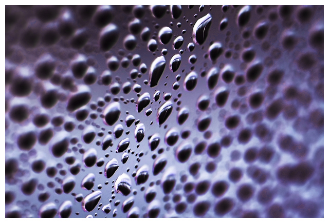
Anyway, I like this one. The dof works well but I feel its a tiny bit too narrow, giving a very quick transition from focus to OOF.
The diagonal works well, and the rich tones are good. In fact, I was surprised at the lack of sharpness on the original - you've obviously
managed to bring it out well with curves/USM.
Plain white border suits fine
Its a very nice macro, and technically spot on, but i guess it doesnt have much wow, and the inversion doesn't really add to it - had you played with hue/sat to give the original the same colour, I'm guessing you'd be hard-pressed to tell a major difference, they would just look like a reflection of each other (as shadows would be t'other way round)
This picture has terrific DOF and color. It is not obviously a "negative" because of the nature of the subject matter which may have bothered some people. I would have scored this a 6 because of the quality of the shot. It would have needed to be more interesting to score higher with me. Technically it is strong. It just doesn't have enough punch to score higher IMHO.
Trading Post comment
While voting in this challenge, I often took the pic into PS and inverted to see the original. The neat thing about this one is the negative appears to go right to left as far as field of view; the positive is just the opposite (though it you look long enough, they both go both ways).
The reason I didn't score this higher is that it didn't seem "negative" enough to me - in other words, I didn't get the impression I was looking at a "negative", though I knew it was. Technically, you did a very good job with the DOF and exposure. You may try cropping off part of the right side to bring the focused drops just a bit closer to the viewer.
this is a very nice abstract, but unfortunately this wasn't an abstract challenge.
negative images can be really tricky, you have to think in negative colors while composing a shot.
I do like this shot, it looks like this is drops of mercury not water, has a real metal feeling.
the DOF makes the image even more appealing, but I think it would have benefitted from a rotation to make it horizontal, like looking at a table with droplets, and make the droplets that are in focus positioned at the upper third of the image.
I didnt much care for this one. The DOF leaves me feeling a bit woozy. ( although that may have been your intended effect). Would have liked to have seen more detail inthe droplets maybe. And I think tweaking and bringing out colors would have helped out as well - giving the whole shot another dimension. Looking at the original I am not sure if you could have gotten color out of it. Maybe a tighter crop to get rid of some of the intense blur as well.
Nice DOF. I like that the sharpness seems to just fade as you go out from the center. I'm surprised you didn't score higher with this. Must have been the "abstract trolls", LOL. Overall, I couldn't tell you how to improve this, because I like as is.
This has a really neat abstract feel to it. It might have a little more "interest" if there was something behind the window in the center that was really bright and colorful but still "abstract". Nice technical work, as far as focus and exposure.
--Trading Post Comment--
I didn't vote on the negative image challenge, as it was way too painful to sort through that many negative images. That siad, I am very suprised that this one didn't place higher. It is one of the few that still leaves a pleasant image as a negative. The focal point is perfect, though centered, leading the eye all aound the photograph. This is also a very interesting depth of field. Even looking at the original, its hard to determine how you pulled it off. I also think that the lighting and exposure are terrific. I have no idea on what would improve the scoring of this one. It would have been one of my 7s or 8s had I voted.
I like the title of this image quite a bit :) It's an extraordinary concept actually :) The image is very well done, but I fear that it can't be distinguished as a 'negative'. I hope it does well here :)





 Add photograph to your favorites
 Add photographer to your favorites

 Photographer found comment helpful.


