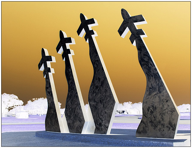
This is a sculpture at Randolph Air Force Base. The shot was taken late in the day, when the sky was very blue. I actually prefer the negative to the positive. Inverted using curves, slight tweaks in hue/sat, resized, added border. USM thrown in there twice.
Unedited, resized original:
Statistics
Place: 13 out of 438 Avg (all users): 6.3785 Avg (commenters): 7.7619 Avg (participants): 6.2541 Avg (non-participants): 6.5435 Views since voting: 3163 Views during voting: 321 Votes: 214 Comments: 44 Favorites: 2 (view)
Everytime I see this image in your portfolio, I think to myself, that gee, this is such a strong image, as it has so much impact, and great leading lines. It is a very powerful negitive, as negitives are often softer in appearance. Well done, and I really love this one. I voted high on this one, but had to add another comment, as I have seen it often lately, when commeenting of your other images in your wonderful portfolio.
This image grabs you. The change in hues, rather than being a gimick, enhances the viewing experience. Great work. Voted - but took too long to comment!
This is a wonderful shot. The negative effect is striking, to say the least. I'm sorry I missed it during voting, but I would have given it top marks.
(See how it looks without the trees.)
This is a great example of where the negative is a lot more dynamic than the positive. First of all, congrats on the 2nd best score to date.
The inversion has really brought out the textures in the marble (?) of the sculptures. The colours are very bold and contrasting. This all adds together to make a really bold, cool, graphical image.
The thing that distracts here imo is the background - it gives context with the inversion, but detracts from the very graphical style of the photo. I'd like to see a lower angle, so that the trees disappear into the horizon, and are barely noticeable.
Other than that, you've caught it at a good time of day light-wise - I love how the shadows on the righthand faces give the bold, contrasting white outline in negative. Overall, great image, good work, well done etc.
Keep it up, its an honour to critique :)
I like the sharp clarity against the empty sky. It gives a stark power which, for this sculpture with its particular meaning, is very effective. The only change I might have liked is a shallower DOF to really bring it out alone against the bit of background. That's very minor, though.
I notice the feedback you received from DanSig. I would agree with the idea about the wide lens and stormy clouds, however I feel the sky does work very well in the negative and adds to the feel of this picture.
I disagree with his view about direct representation of art. If this had been in the “positive” that would be a fair comment, but by reversing the colours I feel that you have moved away from an art representation and into an abstract.
this is a very interesting image, but still it should have beeb DQ'ed because photographing artwork as the main subject of the photograph is against the rules.. I think...
but it's not my job to judge that..
the image could be improved a bit.. maby not this particular shot, but some pinters to use if you shoot this subject again...
the image would benefit from a wider lens, the sculpture takes up too much space to the sides in the image, the sky is not interesting, for a negative image some really dark stormclouds would have been great, the horizon if well placed at the bottom of the image, that´s about the only thing interesting in the image
try shooting again with these pointers and see if you like the result.
Really just a beautiful image that truly works well in negative. Colours are outstanding, and the sculpture, of course, makes for a fantastic composition. I think the shot was well taken and the subject perfectly placed. A slight distraction for me is the far background of trees. Had the left, taller ones not been in view, maybe I wouldn't notice so much. Overall, very lovely! Congratulations.
Trading Post...
This is a really cool image in negative! The colors are fantastic. Congrats on your second highest finish as well. I couldn't give you anything to improve this, I like it as is. I didn't vote on this challenge but probably would have given it a 9 or 10.
[[Trading Post]]
Wow. This is an absolutely gorgeous example of the negative image technique, and I'm surprised you didn't fare even better than you did. I can't offer a doggone bit of advice as to improving; it would have been a definite 10 if I had voted on this challenge. Congrats on a great score :)
First off - congrats on your top 15 photo. Well done. THere were so many shots that did NOT work well in this challenge. Yours was far from it. Great colors, cool textures on the statue and the background looks great. You have a well balanced, well done shot here. (Pushing you out of the middlin again).
--Trading Post Comment--
Top 15 finish, very well-done. I think shifting more to your right and cropping off some more of the left would have made it even better. My favorite element in the shot is the texture that the metal sculptures revealed in negative. Very well seen and nicely executed. Congrats on the top 15!
Great composition. Great choice of subject for a negative image. Really cool inverted colors. I really felt that something that was more graphic art in nature would perform well in this challenge, and look what rose to the top(IMO).
WOW!!! This photo is so powerful! As striking a monument as this is, I have to think it looks even more amazing as a negative image than in true form. This is a standout in this challenge in my opinion!!!







 Add photograph to your favorites
 Add photographer to your favorites


 Photographer found comment helpful.


