Well powerfull dicusions about this one even befor people saw it.
This is a photo i am proud of and will probably allways be.
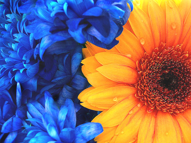
Can't even remember what i did to it in postpro.. not much thats for sure, Made the Gerbera look more orange then yellow so i would match the blue..
Tell me (presuming that i got my regular low 5 or high 4) what i did wrong.. why dose this not work for you.. ANYTHING AND EVERYTHING can help me..
*post challeng*
Thank you everyone for your nice comments, pleas ceep them coming :)
Statistics
Place: 28 out of 287 Avg (all users): 6.1450 Avg (commenters): 7.2000 Avg (participants): 5.8354 Avg (non-participants): 6.2737 Views since voting: 2470 Views during voting: 369 Votes: 269 Comments: 49 Favorites: 4 (view)
I think the colors in this shot are so strong. I love your title too :) hehehe, it does appear it was popular in the voting. I like the even lighting without harsh shadows. My only suggestion would be to increase the DOF so that the closest petals to the camera were also in sharp focus. Great job :)
Lovely vivid color. Someone mentioned below that it appears a little washed out and I have to agree. Perhaps you should try to bump the contrast just a tad and USM just a tad bit as well. The part of the blue flower in the upper middle of the picture also is distracting for me b/c it is so out of focus.
"Tell me (presuming that i got my regular low 5 or high 4) what i did wrong.. why dose this not work for you.. ANYTHING AND EVERYTHING can help me.."
As i said, the main thing i didnWHAT I DOLIKE ALOT, however, are the blue flowers on the left. i really really REALLY think that they turned out fantastic. it's as if there was movement all while being so calm and soothing and delicate and graceful and for THAT i congratulate you!
Not a special fan of flower photos and it really has to be outstanding photo of than kind to thrill me. This does. So crisp, detailed and the colors amazing. Very well done. 8.
yes I think so ;) Blue is to orange as Yellow is to purple. This falls somewhere in between. But still a great shot. The dew drops make this image effective. 7
very dpc-ish because of the droplets what is it with peopel here and putting drops everywhere.
firts the challenge very focus composition can use work but ah wel.. 9
Very DPC-ish! both colours are fantastic and really pop. Very dpc-ish water drops as well. My only criticism is that it really needs a candle and a glass and woody and a woman in a scarf... 10!!! top 10 at least ;)
Very nice contrast and mixture of color and flowers. Good choice. I like the shapes of the petals put together. Good job. Very soft to look at, and I think the water really makes it.
4 - Looks 'flat' in my opinion. Not sure if it is pp or what. Variation in lighting and focal range/depth, may have given this a little extra in my opinion. Don't mind the composition, but, again, would like to have seen a lot more detail in the flowers. edit:typo
it's got all of the qualities people here like...I like it actually! the yellow flower is in really great focus...the blue distracts me a little, but great colours and nice comp





 Add photograph to your favorites
 Add photographer to your favorites

 Photographer found comment helpful.


