Interesting to do a critique on your image but it is difficult if you don't give us any information in your photographers comments. When we do a critique, we go past just the photographic result, that's what voters comments do. The critique looks at what you were trying to achieve, how you wanted it to look and what issues you had in getting the image captured and ready for voting.
First Impression - the most important one: I think this is loely, but it is a little flat.
Composition: Very very centred .. it works ok for this shot .. but not for all ... have a search on rule of thirds .. this may help in future.
Subject: meets the challenge.
Technical (Colour and light): This is a little flat as mentioned by the other commentors ... this could be corrected through contrast being added.
To grow its vote?: think about how others see what you are looking at. What is interesting in the shot .. and what you think will come of it ...
Summary: This is great for your second challenge .. well done and keep it up!
If you've got any questions about this critique, please feel free to contact me via the PM system.
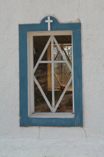
hrmm not sure exactly what you were going for here...it looks as though you though "ok there's a window with a window inside with a white wall, lemme take a picture of that...boom, snap done" ...
Stop to think and compose and bring out what elements are really there -- something made you stop and take this photo...try and convey exactly what that is when you stop to take one.
Might have cropped right down to the edges of the window frame, or closer to provide more detail. Another idea might have been to darken the white wall to make the light stand out more. Just an opinion.
I like this shot, however, IMO, I would have made the straightening points on the sides and not the bottom. The angle is a little distracting, and ,maybe a closer crop on the bottom.
I would like to see more contrast in this photo, make the colors become more hars, then you also would have got ride of some of this reflections in the windiw.
The idea of your entry is nice, but I think the composition could be better. You could place your subject outside of the middle to avoid a dull photo. Could use some contrast too.
I like this, but I think it may be underexposed, or maybe there is a problem with white balance. (Rookie trying to comment here!). But it is neat. Good luck.
I like this idea of shooting through two windows at once. Perhaps I may have used it once or twice myself. I hate to say it, but this iamge may suffer in the voting, as it doesn't really "pop". My images suffer that fate quite often. I hope I'm wrong.






 Add photograph to your favorites
 Add photographer to your favorites

 Photographer found comment helpful.


