|
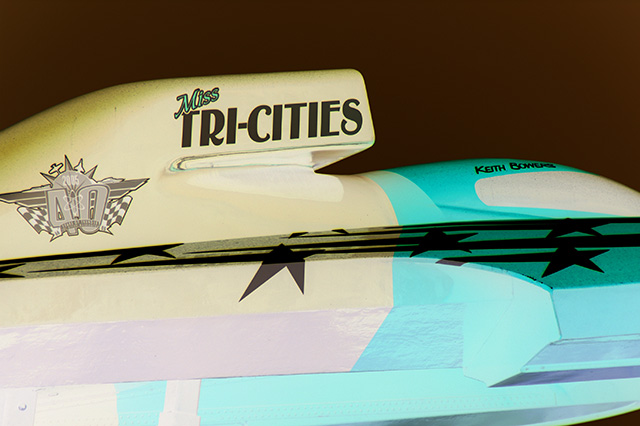
First of all, I don't like how you cut off a portion of the logo to the left. The subject is also not quite interesting - I think I would have liked it better had you shown either a larger portion of the subject or perhaps used another angle instead of straight on. |





 Add photograph to your favorites
 Add photographer to your favorites


 Photographer found comment helpful.


