Author Thread Comments Made During the Challenge
Post actions
creative!! love the title and what you have done!
Post actions
Composition feels balanced, but needs something extra to raise this above the commonplace.
Post actions
Nice but compared to the rest of the challenge, this is very mediocre, it needs some kind of main subject in the window, like a person looking out. At least I can´t connect with this photo without a main subject. 5 from me.
Post actions
Nice image. The window as the subject in the window cool.
Post actions
Dosen't really hold my interest.
Post actions
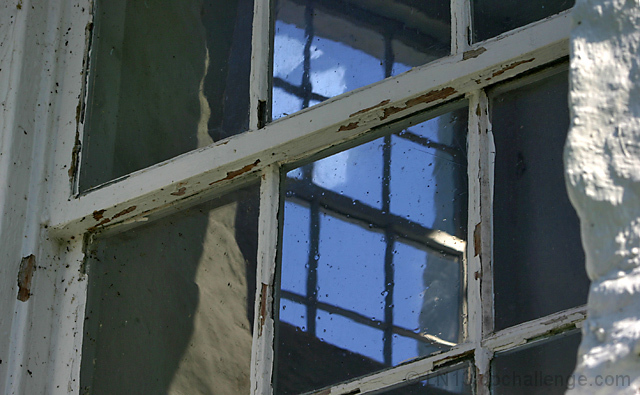
Perfect for the challenge! The contrasting angles between the two windows work well and I love the simple color scheme. About the only thing I'd change is to somehow tone down the brightness on the wall on the right. Nice work.
Post actions
I love the peeling paint. Interesting picture
Post actions
Post actions
hehehhehee.... i like the way youre thinking here ;)
Post actions
good idea but not very interesting photo... the concrete wall to the right distracts.. a vertical framed photo of the center would have been better..
Post actions
This is a very interesting window but I wonder if it wouldn't have looked better in a vertical shot. However, that is a subjective thought.
Post actions
nice idea, i just think it's a bit too busy
Post actions
Post actions
Seems to tightly cropped. It might be better if this shot were taller.
Post actions
Post actions
good diagaonals, maybe a little dark on the LH side
Post actions
nice concept. I do like the blue in a field of gray. The slight OOF on the right is a bit distracting. maybe it is the highlight rather than the DOF that is the distraction. Some burning may have been good there. 6







 Add photograph to your favorites
 Add photographer to your favorites


 Photographer found comment helpful.


