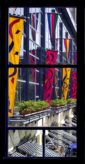
Fiesta banners in the courtyard at the River Center shopping plaza in San Antonio. Learned a new PS thing on this challenge - how to use the crop tool to correct perspective. Handy, that!
Post: That's "Colorful".... dang typos.
Based on comments, here's another crop:
Statistics
Place: 71 out of 180 Avg (all users): 5.5800 Avg (commenters): 6.3333 Avg (participants): 5.4362 Avg (non-participants): 5.6667 Views since voting: 1100 Views during voting: 360 Votes: 250 Comments: 30 Favorites: 0
First impression of this photo for me was strong. I like the bright colours, and the framing matches them well. The vertical banners present the colours well, breaking up the reflective surface of the windows behind them in a pleasing manner.
I likely would have cropped the lower portion out, to omit the portion where the window is split horizontally in two. That area, in my opinion, detracts from the rest of the composition.
The bright colours work really well with the black borders - certainly you did well to spot the potential. I really like the dynamics, but it does seem a bit busy a composition. The 4 different "windows" add a real interest to the scene, but haven't been fully exploited - there don't seem to be distinct different subjects in each frame, except the row of plants in the middle one. If they all had centred on somthing different, or some been empty to contrast with more full ones, this could have, I believe, added somewhat to the composition.
I'm curious as to how the scene changed at different times of day. The light seems to be high in the sky, facing the wall directly - maybe earlier/later you may have got some more exciting lighting - maybe backlightinh on the flags, or raking light across the jutting-out-bits of the building.
after reading thru other comments - I agree that maybe it could have been made less busy by cropping out the bottom frames. I think this could have lent interest had they bee nframing something specific, but as it is, they just add confusion
--Trading Post Comment--
You captured the vibrant colors needed for high votes on here, but the subject is too busy for my taste. The color and clarity are fabulous, but there is just too much to look at. Perhaps isolating an individual pane would have made a more dramatic impact. Nearly 5.6, not bad for this site.
I like the window itself, but probably would have cropped the bottom split frame as the view through there is very distracting. As it is, I probably would have voted this a 5 or 6, cropped would have been a 7.
there doesnt seem anything interesting in the photo except those banners and that is not powerful enough to carry the photo. i think it is just a bit flat except for those colors. that is just my opinion and i have no way of fixing this.
the photography is good. just not the subject? hope that is helpful and not mean. not intended to be mean.
I really like this shot, even though you had to physically give up a lot of pixels due to the crop and size limitations. The horizontal window bar 2/3 of the way up really hurts you, I think. It is beautifully colorful, but it starts to be confusing after a few seconds of looking at it. Almost TOO much information. Good processing and technical shooting, I'm just not sure about the composition. Obviously you didn't have a lot of choices if you wanted to include the windown frame. I didn't vote on this pic but would have problem given a 6 or 7.
You scored just enough to help squeek you out of the middlin masses. I liked the composition overall. Areas that I thought could be better - The colors are nice but the overall look of the outside seems a bit dull, maybe even like a light haze. I think the colors could have popped out even more. Getting really picky now - you may have wanted to rotate the pic ever so slightly to have the frame square with the frame. Now all of this was me getting really really picky. I gave the shot a 6 overall. Thought it was a very nice shot.
I did not comment on this photo during the voting (I think because it appeared on my monitor near the end when I was a bit rushed) but I remember two things about it: (1) it is very very colorful, which I like, and (2) the shape of the window frame is relatively narrow given the verticle space, which I am not so fond of. I know there is not much you can do about the shape of a window (and this one at least echoes the shapes of the flags) other than to include some of the wall in which the window sits or, perhaps, crop out the bottom pane.
It strikes me that the slatted shutters and the shadows they throw up on the wall, as well as the blue object in the lower right corner, make this picture a bit "busy" for my taste. I think that's why I like the idea of cropping out the bottom pane.
There are many things that I do like. Besides the very vibrant color, which I have already mentioned, I also like the glass windows because they are more muted and allow the flags to take center stage. They are the "canvas" upon which the flags are "drawn" so to speak. I might have even used a polarizer lens to further mute them if possible. I also like the perspective created by the horizontal bands of metal on the glass wall. They give depth to this photo. And I like the black frame of the window itself because the color contrasts nicely with the flags.
All in all, there is much more to like than to question with this photo.
I like you use of color here. Interesting window as well. To me the lines between the framing window and the subject window, however, are a tiny bit distracting at some places in the image.
An interesting division of space in that frame; but the 'view' perhaps lacks a sense of harmony, of humanity, for me. Entirely competent work, but it doesn't have that spark of fsacination for me.
Hey. . . I recognize that gorgeous spot :) But I have to say I've never seen it looking so awesome! Great idea for this window challenge! It is perfectly executed, and I love it!!!!





 Add photograph to your favorites
 Add photographer to your favorites


 Photographer found comment helpful.


