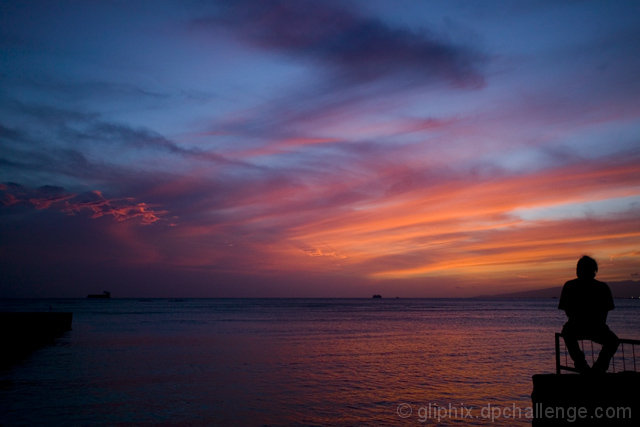
Nice Colors. IMO, if you were to crop off a little more of this photo on the left side it may do better. I think its a little dark anyway and the nose of that boat doesnt help with the composition. Just my opinion though. Sorry to be long winded. :)
thank you for specifying what colors we're working with here we couldnt tell on our own. title doesnt add to the photo but the photo is appealing in itself. 6.
Lovely picture but im not too keen on the guy sitting on the right hand side, dosent detract much from the picture but i found myself looking at him rather than the sky.
For me, having the person so far to the left throughs off the composition a little. If he/she was just a bit more toward the center I think it would be better.
3 - A much stronger crop, quality dependent, make this better in my opinion. Silhouettes and 'balance' works quite well, but the unusual patterns and colors in the sky especially, for this Challenge, likely put to better use with a tighter crop.





 Add photograph to your favorites
 Add photographer to your favorites


 Photographer found comment helpful.


