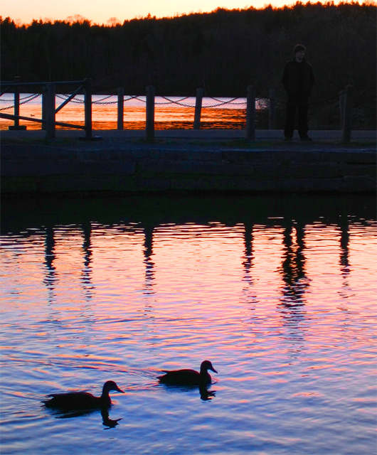
Couldn't believe my luck that during the complementary colours challenge I was up at the park with my camera when a bright blue and orange sunset took place.
Editing was hue/saturation and resizing. That's it. Here's hoping I do alright with this.
Edit: Holy crap. All the grossness doesn't show up on my monitor, and now I see all the problems on this one. : ( I'm going to have to start editing on a different monitor.
Statistics
Place: 215 out of 287 Avg (all users): 4.7126 Avg (commenters): 5.2500 Avg (participants): 4.5682 Avg (non-participants): 4.7892 Views since voting: 931 Views during voting: 326 Votes: 254 Comments: 13 Favorites: 0
This is an intereresting scene and the silhouetted ducks really make it work nicely. Your subject standing on the pier is visible but he's too dark to really stand out enough to be 'noticed' on a site like this where the photo probably gets very little viewing time. The composition is nice, but I would have probalby framed out the skyline at the top. Personally, I don't think it's adding anything to the theme and it's creating an eye-pulling contrast away from the subject(s) of the image. That tree line is also pretty soft. Maybe some additional depth of field would have improved that area. I see that your camera doesn't support that level of manual control though... When you are limited by the camera, you have to work within it's strengths. I have a camera similar to this (S410) and it does make nice photos :)
2 - More 'play' with the colors and a nudge rotate up on the right, make this better in my opinion. Looks like it has some grain/gamma issues as well. Like to see this shot have been all about at least one set of complementary colors primarily.





 Add photograph to your favorites
 Add photographer to your favorites

 Photographer found comment helpful.


