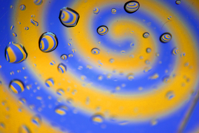
A fairly simple idea, but extremely low budget, as i have no money after buying my camera. Post processing included tweaking the hue/saturation to make sure it was obviously orange and blue. I had a purple and yellow version, too, but there was too much editing involved for my liking.
Statistics
Place: 110 out of 287 Avg (all users): 5.5526 Avg (commenters): 5.6842 Avg (participants): 5.1266 Avg (non-participants): 5.7326 Views since voting: 1565 Views during voting: 351 Votes: 266 Comments: 21 Favorites: 0
This is a pretty cliche treatment here at DPC, but not a cliche as the wine glasses filled with water to refract colors. Also, complement to blue looks much more yellow than orange as the challenge details.
im not a fan of the droplets technique but this is ok. i like that its very imperfect in the sence that most of the drops are out of focus and none of them are really round. really makes it feel like oyure going downa spiral.
nevertheless the photo itself is a bit uninteresting and not esthetically striking. looks a bit rushed. take your time. could have balanced the colors to make a more ornagy yellow. 6 for effort.
I really like this photo!! Great concept, although I have seen a few variations of this done before (not necessarly on this site) I still like it, and the colours of course are great!!
I thought there would be more studio set-ups like this for this challenge. Great use of complementary colours but I must say you DOF is too shallow for my taste. I think this would have been a far superior image if you had used a better DOF and all water droplets were in focus. Still well done and definitely meets the challenge. 7
3 - Bordering on yellow, but fairly minor. More detracting in my opinion is the hair/something and the bar/line/something bottom right. Sharper and perhaps variation in composition and framing, make this better in my opinion.





 Add photograph to your favorites
 Add photographer to your favorites

 Photographer found comment helpful.


