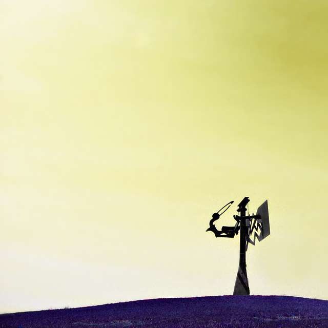
I used hue/saturation to change around the colors in this and to desaturate the red "sorcerer"
I have no clue how this will do but i hoping it wont do to bad.
Statistics
Place: 170 out of 287 Avg (all users): 5.0115 Avg (commenters): 5.5714 Avg (participants): 4.7701 Avg (non-participants): 5.1329 Views since voting: 801 Views during voting: 343 Votes: 260 Comments: 16 Favorites: 0
Let me tell you what I like;
-Nice use of space
-Composition is very good
-Subject is interesting and though ptovoking (also don't know what it is)
What needs work;
The score this image is about right for this image at DPC - DPC'ers like a crisp, sharp image with nice colours. Your blue and yellow doesn't fall into this category 100%. Some voters might vote you down for lack of knowing what the subject is. Maybe for something like this, try creating a name that is a bit more discriptive - which compliments the photo.
I see most of your entries is in the upper 4's and 5's. Now is the dificult imes to convert those to sixes. Love your work though. Good Luck.
Nice use of negative space. I think the colors are just not rich enough for this to work for complementary but I'd love it in black and white. I think it'd be an interesting study done that way.
6 - Like this. Obviously a bit of hue adjusting pp, but it works in my opinion. Like to have seen the yellow sky more vivid if possible. No idea what the subject is. Perhaps a variation in composition, especially this size, may have given this a little extra in my opinion.





 Add photograph to your favorites
 Add photographer to your favorites


