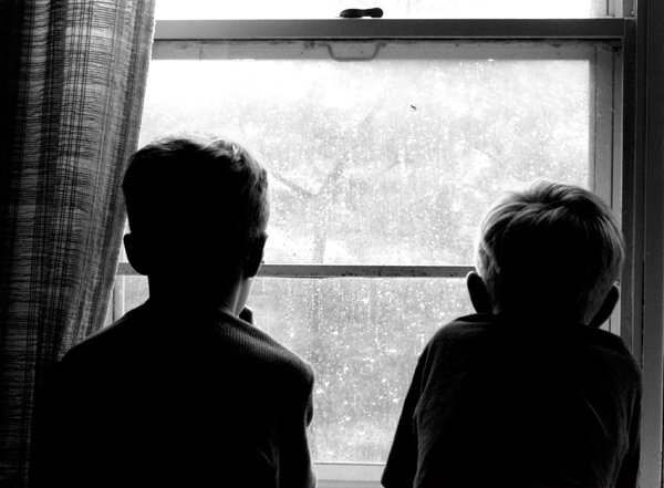
Silhouettes not clear enough. The horizontal line near the centre cuts through boys' heads and makes photo less effective.
Arggggh! Two of the things I most liked about it! The less-than-silhouette treatment established a connection, a small but significant bridge, between the boys and their longed-for outside world; an effect wholly sympathetic to the point of the photograph. Likewise, the horizontal bar serves a useful figurative purpose, too: it is a barrier between the two worlds, reinforcing the fact that they are prevented from going outside. The bar also physically connects the two boys, although this is hardly necessary in appreciating their shared yearning.
I suppose if your ambition is limited to making a graphically impressive (and technically 'correct') image, these things might be viewed as flaws; but if you are interested in producing a more durable and more thoughtful photograph, they are worthy inclusions.
I know that feeling. Saw a similar shot as this but shot from the outside and I like that better, this needs some facial expressions as I don´t really connect to this as it is.
This is a classically good photograph, filled with both charm and challenge for the viewer. Just asymmetrical enough to retain some tension, just enough detail to suggest some emotion, but still contains sufficient figurative blank spaces to demand some effort and imagination of the viewer. Anyone who can look at this and simply bang the "5" button and pass on is brain dead. Great lighting, brilliant conception, admirable restraint, wonderful execution. 10.
This is a really good picture, but in regards to the challenge I'd have to say that the window/frame becomes an innocent bystander, rather than actually framing the subjects.
It seems to be a bit crooked. If it's intentional, it doesn't add to the composition, in my opinion. But, I can feel the mood of this picture nonetheless.






 Add photograph to your favorites
 Add photographer to your favorites


 Photographer found comment helpful.


