Author Thread Comments Made During the Challenge
Post actions
Post actions
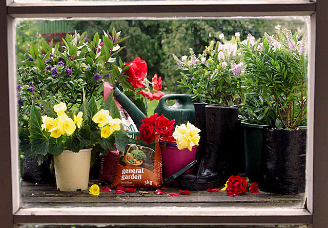
A bit of cropping would have helped here, that and a small rotation down to the right as it´s slightly leaning down to the left.
Post actions
like this, the window seems more like a photoshop border then a window though
Post actions
It's a window, and it's a selection of gardening items. Not sure why I should find it interesting though.
Post actions
Post actions
Nice colors, well framed and composed. The "General Garden" bag is a distraction.
Post actions
This could be an add for a gardening/outdoor shop.
Post actions
Looks just like an ad for gardening products. Great job, wish I still had my garden.
Post actions
Post actions
Nice color and subject. Things feel a bit staged or placed. good work.
Post actions
Good set up. I might have left the 'general garden' bag out. The rose petals are a nice touch and you colors are good.
Post actions
Post actions
I am a gardener also, so I just love this shot, great colors, only distraction I see is the slightly blown highlights on the yellow flowers, those are so hard to get right with any sunshine whatsoever. Good luck
Post actions
The subject is very sharp through the window. Some of your highlights are just a bit blown out. I personally would have cropped a little more at top & bottom to get rid of the edges of those panes. i really like the layout on this. Almost like a painting.
Post actions
This could be an add, great shot! Maybe you could crop the underside a bit
Post actions
lols. Good Gracious is a great phrase, Ima happy you used it in your title.





 Add photograph to your favorites
 Add photographer to your favorites


 Photographer found comment helpful.


