I was the first to make this a favorite during the challenge, as it is a great image..... I love it in fact..... You should have been on the front page.....
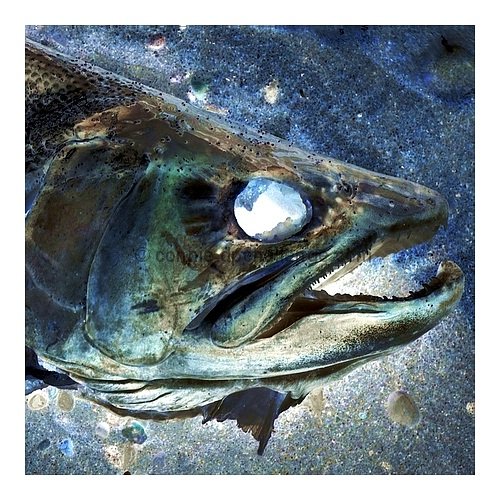
He, the negative image gives the fish a really spooky look, a bit like a zombie because of the bright eye - or rather the absence of an eye. Maybe a landscape crop would have worked better, I think some more of the image to the left would have been good.
A very interesting shot. It's amazing how something can look so good in a negative, and not necessarily the best photo in standard color. You did an excellent job on this one.
this works really well as a negative image. not sure about the composition, though. would like to see more empty space. also, the border is a little too big.
Too much border maybe, but still definite 10 from me. The sand looks like a star system. Goes on my favorites. By far the best yet in this competition (this is my 56th photo to view in voting).
Wow I really love this one! Reminds me of a painting by Mary Pratt.
I keep coming back to this.....it really should be a print. Your frame sets it off nicely, just the way they do prints for framing. There is so much beauty in the ugly dead fish, it is amazing. The eye looks like the earth, too, that is a plus. I wish I could give you more than 10.
amazing! as a negative this is sensational...very good...wish it was bigger...why go 500x500 with a border when you could have gone 640x640??? The border is great and this would look excellent as a print, just wish you went full size 9
This is so surreal, it really appeals to me. The luminesence of the fish works fantastically here, and the gaping eye really draws you in. Well seen and processed. Good luck.
the white border distracts me from a great image. 9, 10 without border. I know its personal preference on the border. Or if the border was a narrower line?
This has to be one of "my favorites" in this challenge, so graphic, and just so strong an image..... I love it, and it is also a "favorite" as well.....






 Add photograph to your favorites
 Add photographer to your favorites

 Photographer found comment helpful.


