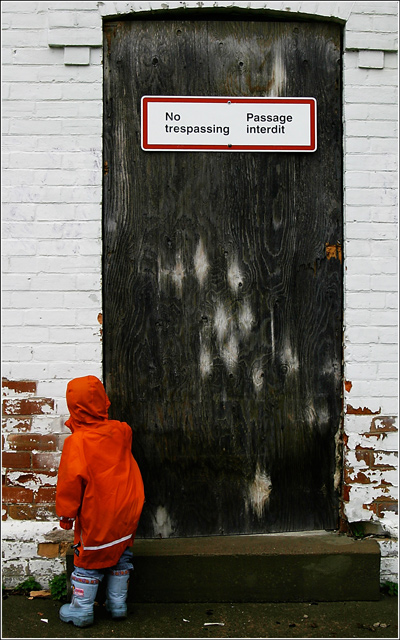
I have shots that are close-up and the orange and blue stand-out more...but I can't do it..I simply like this one more, and it fulfills my sense of the challenge..so it is going to get killed.
straightened in iphoto (I have yet figured out how to straighten in photoshop with the same ease)
then levels, curves, usm in lightness channel, RGB, selective colour blue(-100 black), cropped, added border, save for web.
Post challenge:well there you go- as predicted...now the challenge doesn't say compose using ONLY complementary colours, so i kept mine on the subject..ok really I just thought I 'd test out how people would react to this type of thing..I didn't vote on the challenge because it would have driven me nuts..we need new challenge topics imho.
Statistics
Place: 198 out of 287 Avg (all users): 4.8359 Avg (commenters): 5.3125 Avg (participants): 4.6585 Avg (non-participants): 4.9195 Views since voting: 1001 Views during voting: 343 Votes: 256 Comments: 20 Favorites: 1 (view)
i like this one better than any of the ribbon winners. it's subtle with regard to the challenge topic and, as you already know, subtle doesn't usually score well. voters have to be smacked in the face with the challenge topic. i rarely vote anymore but i would have definitely given this a 10. well done! goes straight to my favs.
5 - Bit too subtle for me. Like the concept though, but for this Challenge like to see 'somehow' those colors more dominant, which given the size of the color scheme here and the size of the main subject, would be pretty tricky.





 Add photograph to your favorites
 Add photographer to your favorites

 Photographer found comment helpful.


