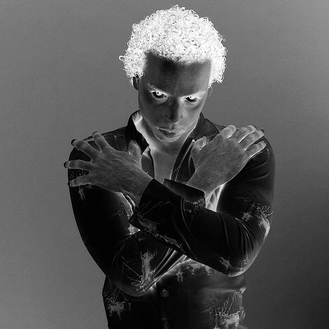
This the kind of shot I expected to see in the challenge, and didn't think anyone would be able to pull it off well - you've proven me wrong. I say that because a negative image just of a person is pretty familiar, and could so easily look like a kid messing around with crazy effects in PS; it takes a lot to give it real depth and make the inversion add to the image. You've achieved this with the atmosphere created by the posture and the really spooky eyes. The expression is perfect for this. I'm wondering whether it would have been good to have a slightly darker/lighter b/g, so its not the same tone as his skin, but obviously both the shirt and hair need to stand out, so this may not have been possible.
I've never really had much experience with portraits, but would it have been possible to eliminate the catchlights? - they look great on the positive, but without them the negative eyes could have looked even more spooky.
The shadows (that have turned into highlights) are kinda distracting, and could have been reduced by more careful lighting - using reflectors to fill in or something)
Seems like not everyone liked it, I guess cause its hard to make a negative of a person look good. Personally I think the stare and expression really makes it, and it works well as a negative. Having said that I think the score was fair - didnt have the ingenuity or simplicity of composition needed to compete with some of the top scorers.
Trading Post comment
I did the "drag, drop, invert" thing for quite a few pics in this challenge - this was one of them. I *really* like the positive version - well lit, well composed, nice detail - all the good stuff. I'm not as fond of the negative. For some reason, negatives of people aren't as appealing as negatives of "things". That said, I think it might be interesting to see in color, reversed, depending on what color you used for a background in this shot.
its a nice pose. i think i would have just cropped it differently. i am thinking that all that space on both sides, that is just grey, is hurting this photo. i think it is keeping it from being more dynamic that would enhance the scary feel that the model has.
Compositionally very good despite being almost dead-centre, but I think that works well to divide the background into an interesting triangle or arrowhead shape. Sharpness and detail are good. Weird hair effect. :) Negatives are a difficult subject to judge, and my personal taste of not really finding anything appealing about inverted people has likely coloured my opinion.
Wow. Great focus, very sharp. Those eyes are incredible. Reminds me almost of a vampire picture. I couldn't possible tell you how to improve this. (But you might want to send this to Ann Rice for his next book cover!)
Spooky and yet still cool. This was (and still is) a very hard challenge to vote and comment on. I gave you a 6 on this but was probably borderline 7. Glad you went with b&w treatment as I dont think color would have helped this. Cool funky shot and I couldnt really tell you how to improve it. Crop is good. Background shading works well and I like how the shirt looks inverted. Good shot.
[[Trading Post]]
This is indeed spooky, with an excellent composition, and it would work very well as the promotional / tribute shot it was intended to be. As an entry at DPC, I can see it being voted down for being too centered and too dark. The background doesn't have a lot of interest; it's kind of flat and plain, and a little "spot lighting" might have really given this a boost. Of course, for it to work, it would have to be done in reverse during shooting, "spot darkening". Not sure how to accomplish that!
Spooky? I'll say. Especially the eyes (which are bordering on mesmerizing). I like the sharp focus (hair on the back of his hands is clear). I don't know what I would do to improve upon this photo. It's already eerie enough.
--Trading Post Comment--
I bet it was a really mice portrait, but, other than the eyes, it doesn't pop as a negative image. The eyes, hands and hair really jump out, but the white shirt that he was wearing adds too much darkness as a negative. I absolutely agree, it is spooky. I didn't vote in this particular challenge, but I would have voted 5 or 6. Definitely above average, just not the wow factor as the ribbons.






 Add photograph to your favorites
 Add photographer to your favorites

 Photographer found comment helpful.


