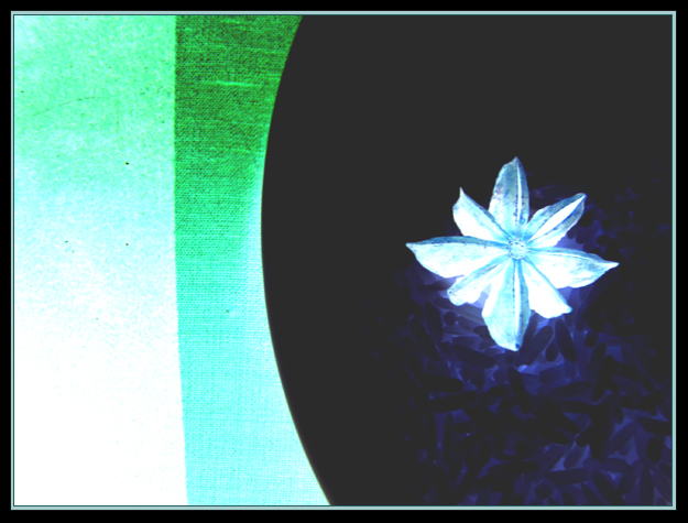
A white tea saucer, jasmine rice, star anise, and a striped pillow. Invert. Voila. I like the way the rice glows in only one direction away from the star anise, like the tail of a comet.
Post challenge:
I have to say, I am supremely disappointed in the voters for this image. The challenge was not "make a negative that looks like a photo". Must you really know what it is to appreciate it? Can't an image merely be pretty? Abstracts are photos too, you know. The narrowmindedness demonstrated is astounding. *sigh*
Statistics
Place: 409 out of 438 Avg (all users): 4.2217 Avg (commenters): 3.5000 Avg (participants): 4.1186 Avg (non-participants): 4.3647 Views since voting: 1471 Views during voting: 246 Votes: 203 Comments: 10 Favorites: 1 (view)
I also agree with Rikki. I don't think this scored low because it was abstract or because the voters are "narrowminded". It scored low because it's just not a very appealing image to look at (that's partly subjective and partly not). Somewhere between 4 and 5 seems about right. Even if this was an "Abstract" challenge, I probably would've given it (and/or its negative/original) the same 4 or 5 score.
As promised yesterday here is my critique on this image. Please understand that I am being critical not to add fuel to the flame but I hope you find this helpful and insightful.
IMHO there are three areas that make an image successful in DPC. I will comment on each one based on your image.
Image appeal: Unfortunately, the scores that this abstraction received is in line with my thoughts. I failed to vote on this image but if I were to hand a vote, I would say this would rank a 5 in my chart. Appeal is a big constituent in the flux of the votes on this site during the challenges. The challenge details specifically state
"Be creative and take an image that works well as a negative".
This image hardly has any appeal I'm afraid. The colors are cold and uninviting. Warm colors tend to score well and are far easier on the eyes. The dark area to the right attracts too much attention IMHO.
Technical The image lacks sharpness and detail. There is visible noise and grain in the image. This could have been taken cared of using NI.
Uniqueness Or the ability to stand out from the pack. Abstracts are a double edged sword. If done well, they score well. But you have to remember that it needs to be top notch. Your image is average so it's a toss up on whether voters will give you a 4 or a 5. At this point, the voters tend to look at the other areas.
I hope this makes sense and I hope it helps you improve.
Apart from the flower I'm unsure what I'm looking at. This makes this a little too abstract for mine, which I don't think was the point of the challenge.





 Add photograph to your favorites
 Add photographer to your favorites

 Photographer found comment helpful.


