First Impression - the most important one: Right direction .. yeah I think so .. there are soooo many improvements form the last picture I critiqued.
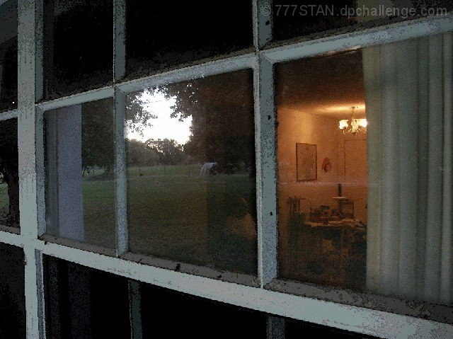
Composition: I think this is done ok. There are always issues when the main feature we are looking at is dirty .. be it a glass of wine .. coffee cup that is grubby .. is a really dirty window. Sometimes ... it pays to ignore what other people think and clean up that bit that needs it ... in this case the window glass needs a good clean to get a good reflection and to be able to see though easily to your father in law.
Subject: Met the challenge .. and did it quite well .... some tidy up needed on the execution. I think this pushed you a little more .. and the fact you are happy is good. Maybe the issue is there is so much ... the reflection of the outside scene and the inside scene.
Technical (Colour and light): I like this is different ways .. the natural outside light vs the inside lamp .. is quite a difficult and crucial balance here.
To grow its vote?: A number of commentors made mention of noise .. this is something that bugs me here .. but I thought was good enough to still give a reasonable score. Try taking a look at neat image .. they have a freeware version .. it may just help with that aspect.
Summary: Told ya last time .. you will improve if you keep trying.
If you've got any questions about this critique, please feel free to contact me via the PM system.
Thank you so much for commenting on any of my photographs, but especially this one. If you thought the treatment was a bit artsy & ugly to be tasteful, you're not by yourself.
I could here my father-in-law inside as I captured this "Piece of Work" or "Work of ART" or something like that. "Why is he out there taking a picture of my dirty window?" Dad Auton is actually in the photo faintly in the lower right-hand corner of the center panel.
It was his comment that prompted me to adjust the bulk of the photo in a watercolor filter while saving the panels in near-original layers. The scene was too unique to risk missing it while I washed the windows.
So, there you have it! The lighting was right, but the subject left a little to be desired. The artist's constant tension.
Overall, I was very pleased with the reception of this photo. Seems I am headed in the right direction. I am indebted to all of my peer-educators. Thanks again! Stan :)
I dislike the effect put on this in photoshop, the grain and artefacts in particular on the window posts. Sorry but I just think it looks awful :( 3 from me.
The double scene is a good idea, but it's more than a little distracting. The glass is too gritty to try and reflect off of. Would of been better to just focus on one or the other.
I like the idea you hade here, but I think that he bright white circle is far too distracting. Composing a little differently and exposing a little longer would have made this one a contender. Great detail with the dirty window and nice focus.





 Add photograph to your favorites
 Add photographer to your favorites

 Photographer found comment helpful.


