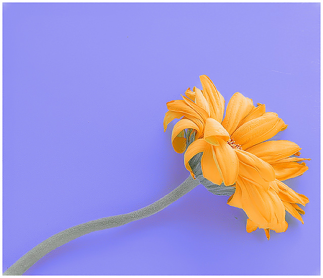
Used three light sources, natural light from a window on the left, a small lightbox to the right and a bounce flash off the ceiling.
Editing: Unfortunately I didn't have the right color paper used for the background so I had to darken it selectively (the legal way) and shifted the hue just a bit which caused some fringing on the edges. I actually didn't mind too much but would have fixed if this was advance editing. The color on the petals was also shifted from yellow to orange.
Shadow/highlights were used to bring down the contrast a bit after some curve adjustments. Also used noise ninja to clean things up a bit and USM was used as a haze cutter and to sharpen at various stages.
Statistics
Place: 47 out of 287 Avg (all users): 5.8992 Avg (commenters): 6.0000 Avg (participants): 5.5233 Avg (non-participants): 6.0872 Views since voting: 1049 Views during voting: 337 Votes: 258 Comments: 34 Favorites: 1 (view)
First Impression: Hah! Flower shot! 3!(j/k) It's a little gloomy for a flower shot -- which gets my vote! 7 or 8, 'cuz gloom rocks.
Composition: 5 or 6. There's too much headroom, IMO. But if you're going for a square crop, I guess you should align the flower diagonally.
Subject: 4. Sorry... it's a flower! I don't particularly like flowers... still, it's a dying flower. So, fine... 6.
Technical: I like what you did with the colours and the contrast. Undertone works for me. It adds a lot to the gloom. 6.
Summary: It's a flower shot. But a gloomy flower shot. In the end, you did good... I guess.;]
Disclaimer:The following crits are personal opinions, not photographic dogmas. Please see them as suggestions, not claims of mastery nor a show of hauteur.;p
Thanks. I figured the sharp edges was going to be a problem and I tried everything to try and fix that under basic editing (wasn't caused by sharpening). I thought it actually fit the image since the petals themselves were already curling up and dying. Also, I took another risk in going with the light colors and low contrast look. I thought it gave it a unique look and went well with the whole "fading away" concept. I know I suck at titles and one even commented to that effect. Anyway, I'm glad some people liked it and I got a fav and some 10s out of it.
This, to me, is a stunning shot. I like the crispness of it. Only reason I can think of that it didn't do better is folks may have been looking for bolder complementary colors, though I think the colors you have here meet the definition quite nicely. Good work!
Simple but elegant ... I like it. Good color combination and contrast. Clone out some of those imperfections and clean up noise and submit for stock - I bet this would do great as stock.
This has a nice pastel look to it. I'm not quite certain though how it seems to look a bit oversharpened to me. You can see fringing along the edges of the petals. 6
This photo is a bit bland... The flower is a bit washed out too. Had the colors been more robust, and had the artifacts of the image not been present, then I think the image would have commanded a 10. It's a solid 8.
This is very pretty. The paleness of the colors works. Great sense of diagonal line. The undulating movement of the stem is nice. Might be my favorite flower of the challenge.
I was going to say, on first look, this is way oversharpened, but on a closer inspection I think it suits the shot...only distraction is the shadow...if you pulled back the flower the background would have been out of focus enough to eliminate that...I like it 7





 Add photograph to your favorites
 Add photographer to your favorites

 Photographer found comment helpful.


