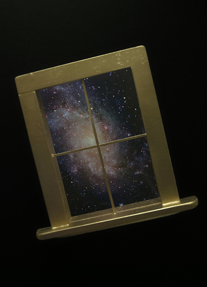
For this image I used one of my astro photos I took of M33. I am making a transition to terrestrial photography due to advancing mac de and wanted to tie the two together.
I sincerely appreciate the comments posted. They will make me strive harder to be better at this art.
Statistics
Place: 96 out of 180 Avg (all users): 5.3983 Avg (commenters): 6.5385 Avg (participants): 5.0460 Avg (non-participants): 5.6040 Views since voting: 1051 Views during voting: 364 Votes: 236 Comments: 31 Favorites: 1 (view)
First Impression - the most important one: I lik this .. the angle works well .. is a little narrow for my taste... also at 406 * 562 the impact is a little lost .. try maximising a little up to 640 on longest side.
Composition: this works but is a little centred in the frame ... is the horizontal was slightly wider this may have helped.
Subject: meets the challenge with a lot of invention . .congrats on the "out of box" thinking.
Technical (Colour and light): I like this .. the galaxy could have been a little brighter .. but it still works .. the flect at the top of the window frame should perhaps not be there.
To grow its vote?: Maximise the size ... think about the rule of thirds ... and go for it.
Summary: For the second pic this is great ... keep it up!
If you've got any questions about this critique, please feel free to contact me via the PM system.
Hmmm, sorry to say that this just isn´t aesthetically pleasing to me, don´t get the black backround and why the window tilts like that. Not bad though but nothing about this photo makes me want to give it more than a 5.
Although the photo has been validated, I can't give many points for a photo which just takes a photo/illustration of a galaxy and puts it in a window frame for this challenge.
Nice idea. I think I like this. I think I would like to more if the universe were brighter and really contrasted with the blackness of the area outside of the frame.
I think to properly pull off this trick shot you need less full-on front light on the frame - the level of illumination there simply makes this look like exactly what it is.
alright love this shot!! i think if the contrast where a little more in the window it would be better...but i can understand that space is probably hard to capture...but anyways 10, and adding as a fave!





 Add photograph to your favorites
 Add photographer to your favorites

 Photographer found comment helpful.


