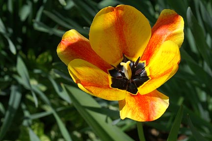
I can see what attracted you to this subject for the challenge, a beautiful, brightly coloured flower which stands out from its muted background, and makes us take notice.
I can only echo the comments made by the voters:
The image is on the small size, and while it shouldn't really matter, it does. It is the first thing poeple will notice, and we like them big here:)Being smaller than the average, you have unfortunately already taken the focus off the image itself.
Meeting the challenge description also counts, and on my monitor the dominant colours here are Yellow and Orange, which as others have pointed out, are not complementary colours. But as you have not left details for your image it is hard to know what you were aiming for.
I think you would have created more impact perhaps by moving in closer and filling the frame with your subject. Do a 'Flower' search here in the galleries and see how others handle this subject, for ideas for the future.
Consider the lighting on your subject before you press that button. Try looking through the viewfinder at your subject from different angles, see what looks best. On your image you have a shadow across the flower, which is possibly distacting, but I think it has helped fool your camera when it comes to exposure, as the right hand petal has blown highlights, so that we cannot see the detail of that petal.
I really look forward to seeing your next challenge entry. Good luck!
I assume the center is purple (too dark on my monitor), so you have purple and yellow in the shot. However, the orange and yellow are the most prominent. I find the shadow distracting, and it needs something different to hold my interest (lighting, angle).
*I am only commenting, and not voting on this challenge*
Remember to use the full 640pix limit on DPC to get the most out of your image.
Also, a weaker connection to the challenge. Not sure if you were going for red/green here.. but what I see are yellow, orange, and green.. none of which are complementary. Blue/Orange, Red/Green, and Yellow/Purple are what are going to be looked for, so I suspect that you'll be getting hit pretty hard.
2 - Composition is not bad. Main thing though is that yellow is the dominant color here in my opinion, followed by green then orange, possibly red, then black. For this Challenge, cropping tighter to get just the 'red' and the green plus making your image 640 width, would have helped you. Fairly well doesn't meet the Challenge though - not 'showcasing' complementary colors here. 'flower' is also not a very 'complementary' title, but your call.






 Add photograph to your favorites
 Add photographer to your favorites


