3 different layers of the picture with 2 adjustment layers.
A lot of stuff.
---------------
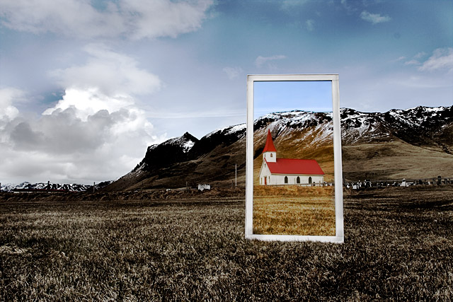
Me and russi where going on a small phototrip to the south of Iceland. While driving out of town we saw this window frame by the garbage on a house that was being renovated so we took it with us.
When we saw this church russi wanted to take some shots so he tried his stuff and I did mine.
I used for this some different tihngs. A couple of adjustment layers of curves, channel mixers and layers and masked the outside and inside of the window for each layer so I worked the inside and outside on their own.
Really happy with this shot and I love seeing that I ended this high!
Thanx for everything. I will uppload this as a print later today.
Statistics
Place: 14 out of 180 Avg (all users): 6.5726 Avg (commenters): 7.7692 Avg (participants): 6.2418 Avg (non-participants): 6.7733 Views since voting: 2583 Views during voting: 508 Votes: 241 Comments: 48 Favorites: 5 (view)
Here is an excellent example of taking an ordinary scene and making one that pops using a simple prop and some decent post processing. If I saw this shot in a challenge normally, without the frame added, I would have never have given it a second glance. By adding the simple prop and making the scene within the scene brighter, you have added interest to the scene and you have given the eye somewhere to land. Nicely done!
Like the idea heaps, gave this an 8 and wouldn´t be surprised to see this in the top 5 tomorrow. Should have cloned out that dust spot in the upper right corner though, not that affected my grade though :) 8 from me.
I thought that this would be more interesting when I saw the thumbnail. I like the concept of the selective desat, but something about it here doesn't seem to work. I think it would've been more effective if only the church's colors ahd remained. I think it's the colored landscape that I am stumbling on.
I like this one, but I would like to have seen a little tighter crop. Perhaps pulling about 1/5th off the right and 1/10th off the bottom, thus getting the fram closer to the lower left corner. Nice toning and crisp focus, and nice exposure overall with all the various elements.
Now this is going to get a ribbon for sure! I'm looking forward to reading how you did this, VERY original and VERY well done. See you on the front page!!
Very cool and creative shot. I would have preferred to see a tad more desaturation outside of the fram eto really make the subject pop. Nice shot nonetheless... I vote 7
I just keep staring at this. It's really imaginative and touching. I don't know. Can't put it into words. It isn't the church... I don't know. I just know it deserves an 8





 Add photograph to your favorites
 Add photographer to your favorites

 Photographer found comment helpful.


